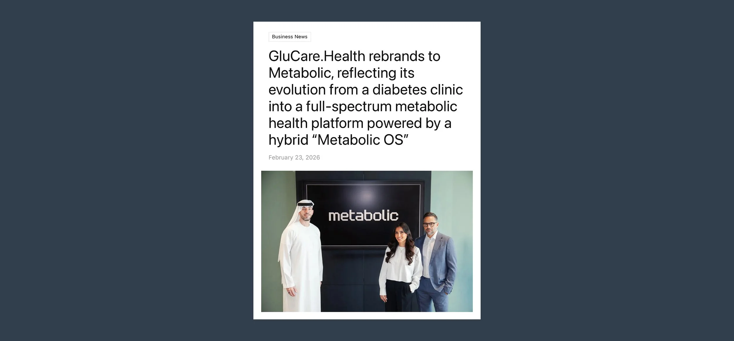
Metabolic
Metabolic is built around making complex health information easier to understand. Our challenge was to translate that same idea into an identity: scientific and data-driven, without feeling clinical, overwhelming or distant.
The creative direction was built around a pathway to clarity - a visual journey from complexity to understanding.
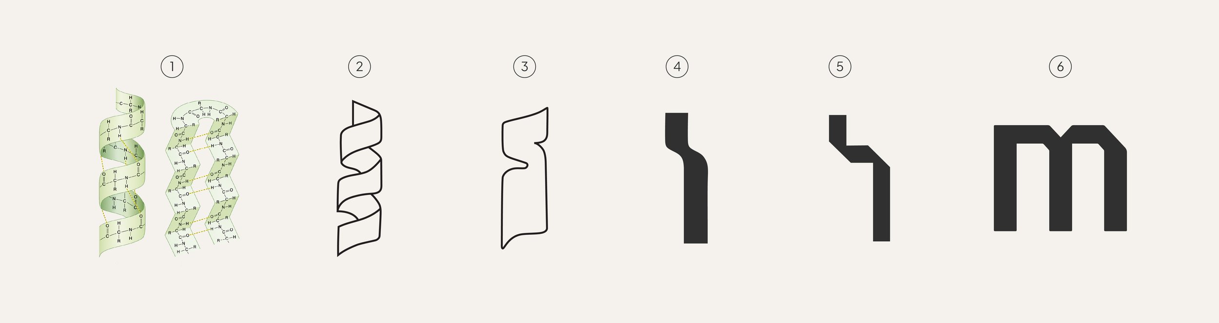
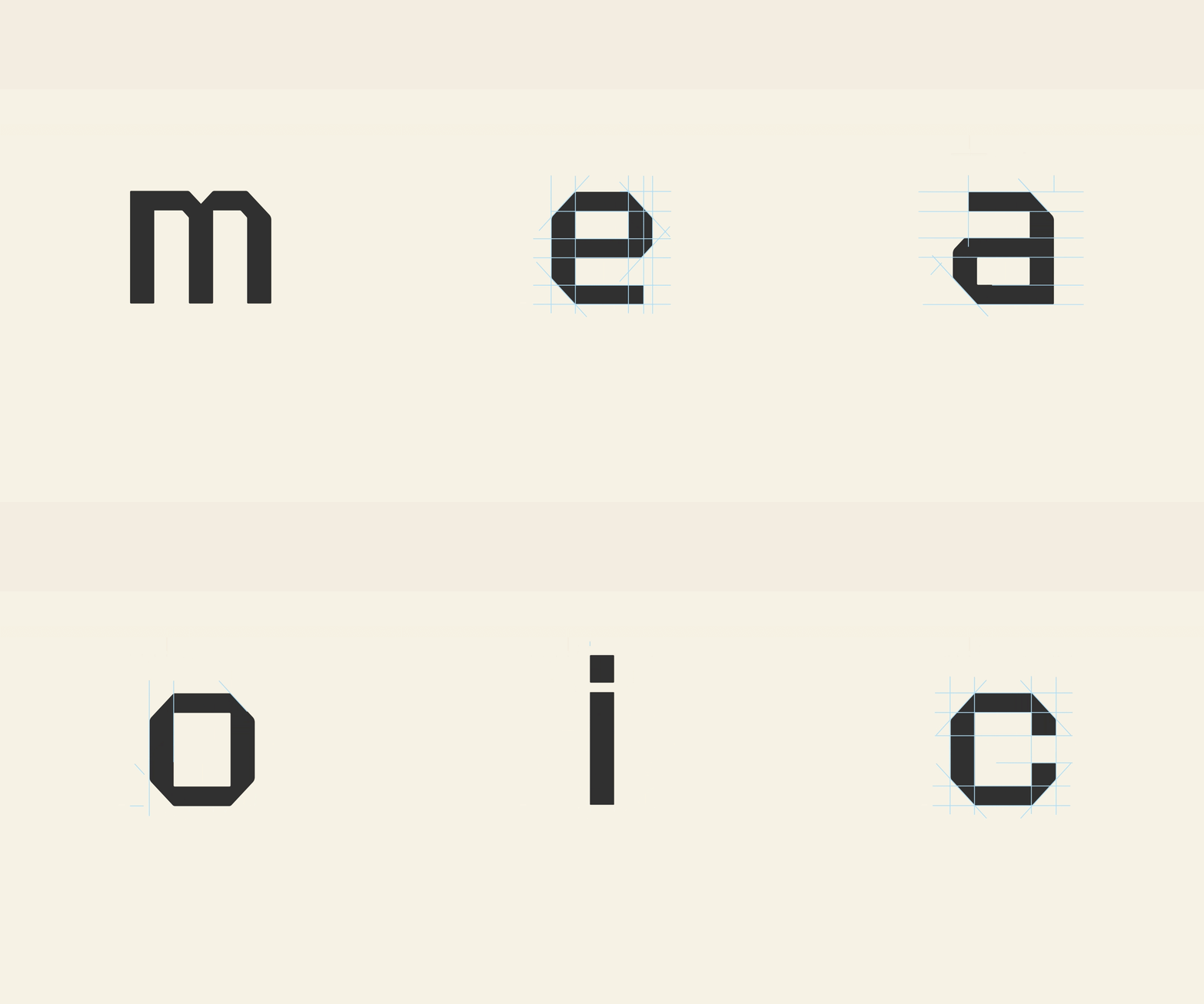
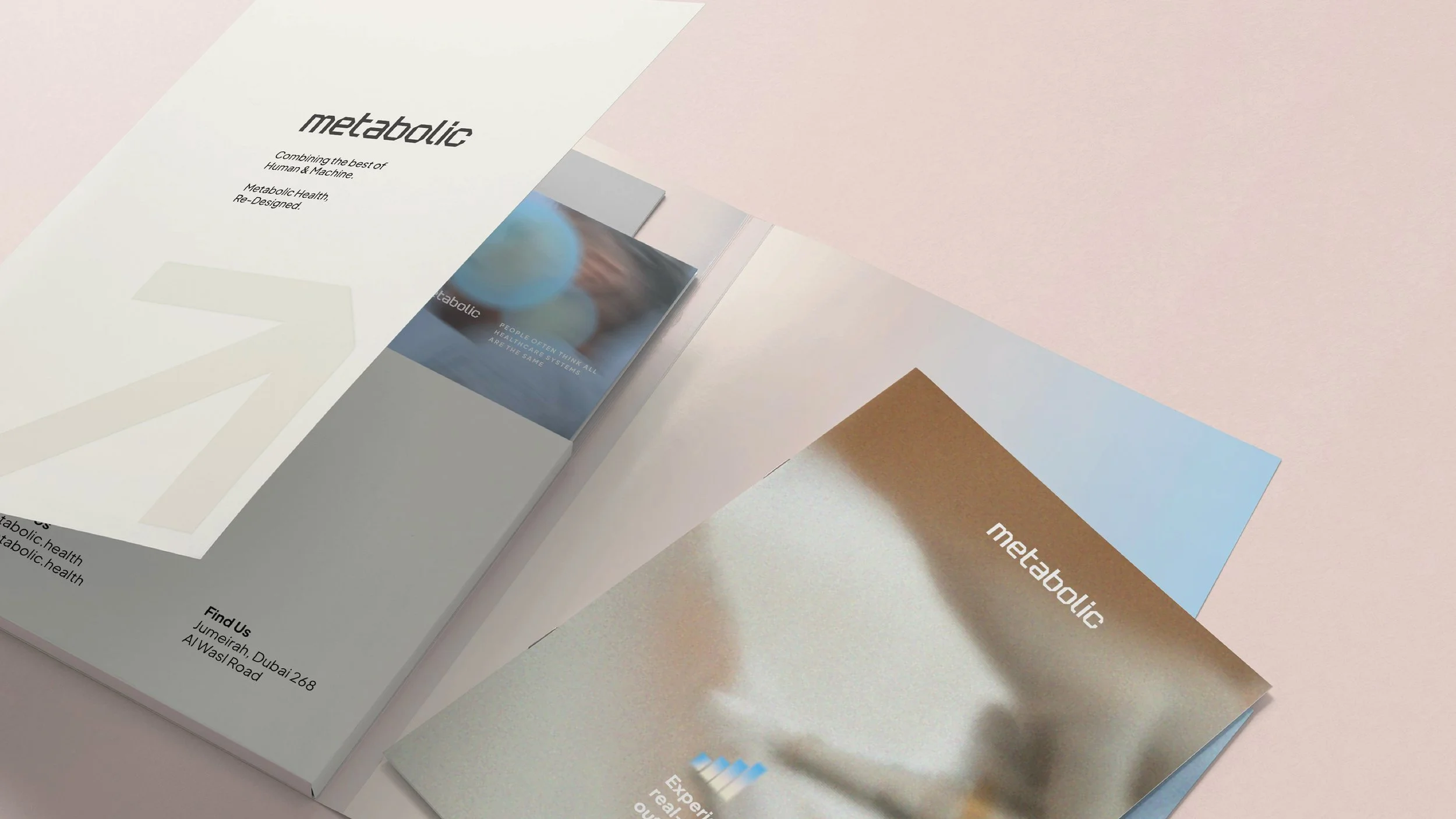
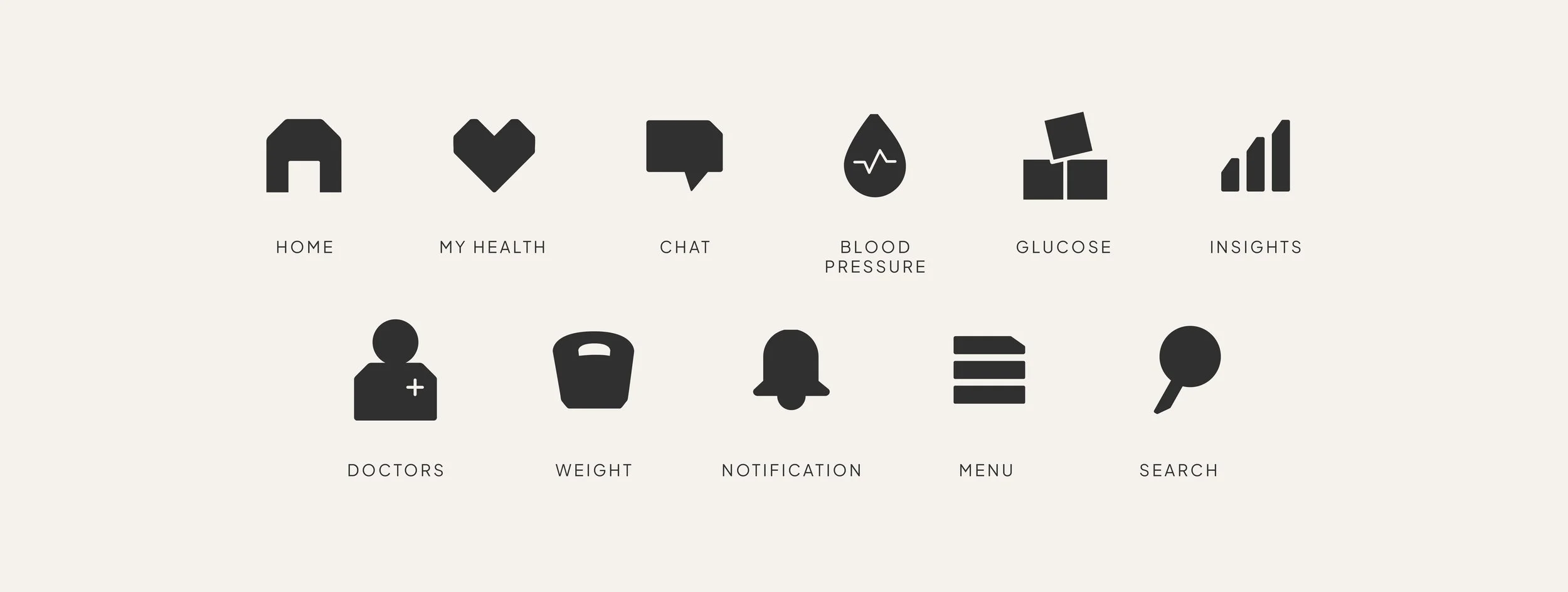
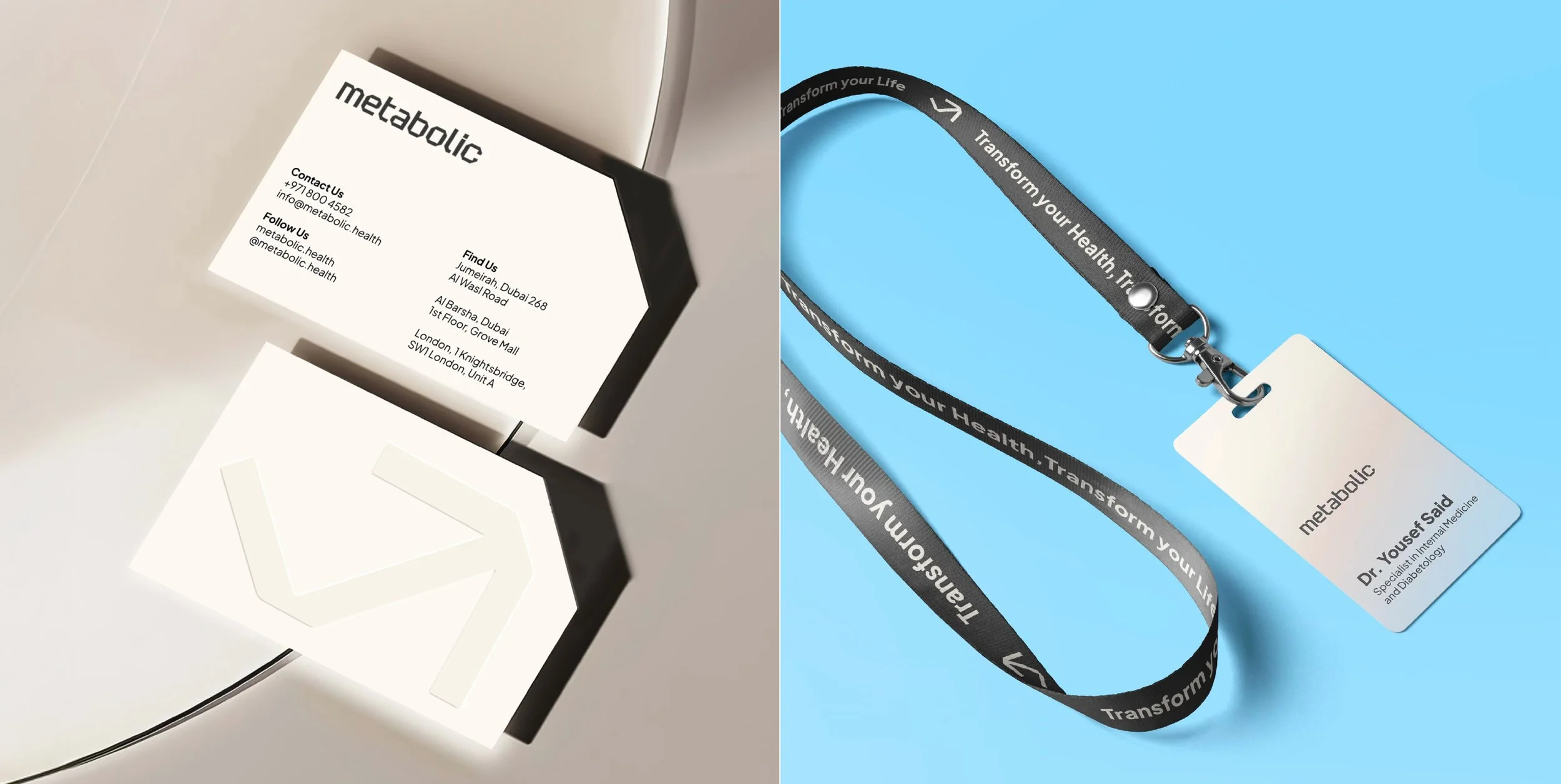
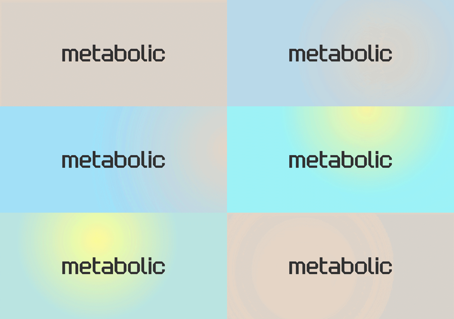
Inspired by metabolic pathways, we created a custom lowercase logotype with rounded junctions, directional bends and a structured geometric construction. The forms create movement and continuity while balancing two sides of the brand: the rigor of science and technology, and the accessibility of a health platform designed for people.
The emblem extends this idea through a simple upward movement, becoming a visual shorthand for progress, growth and continuous improvement.
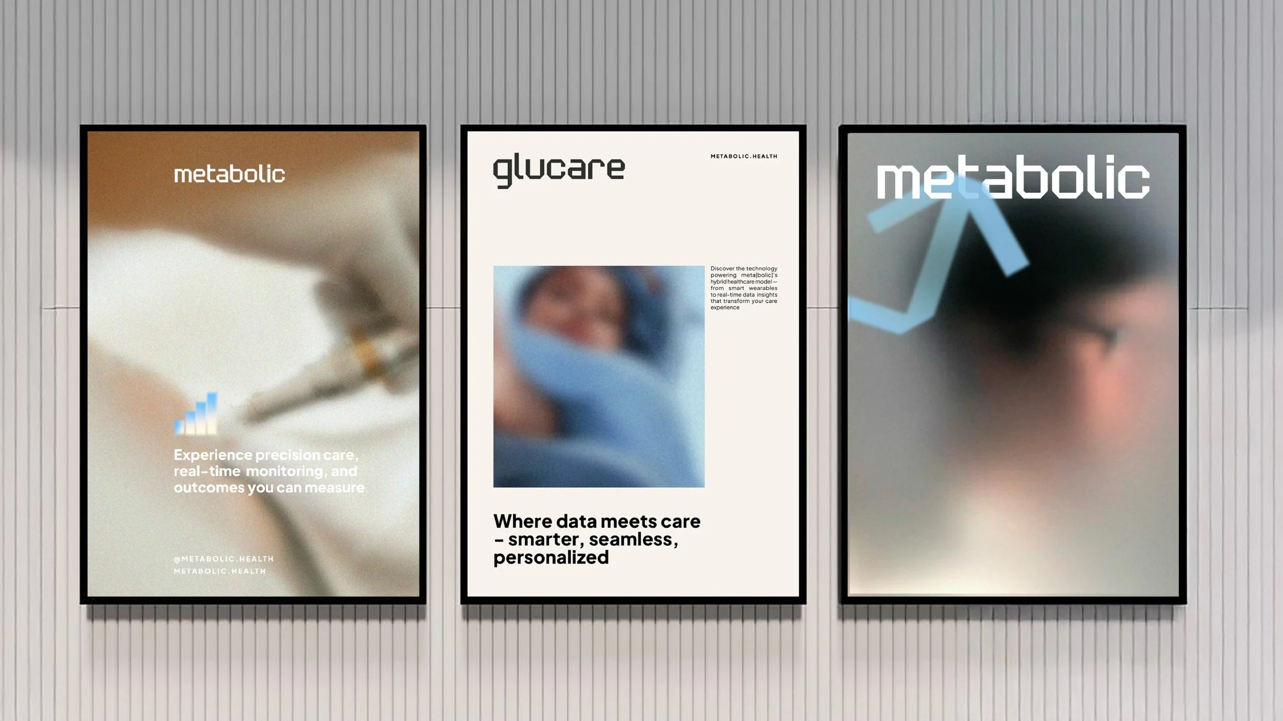
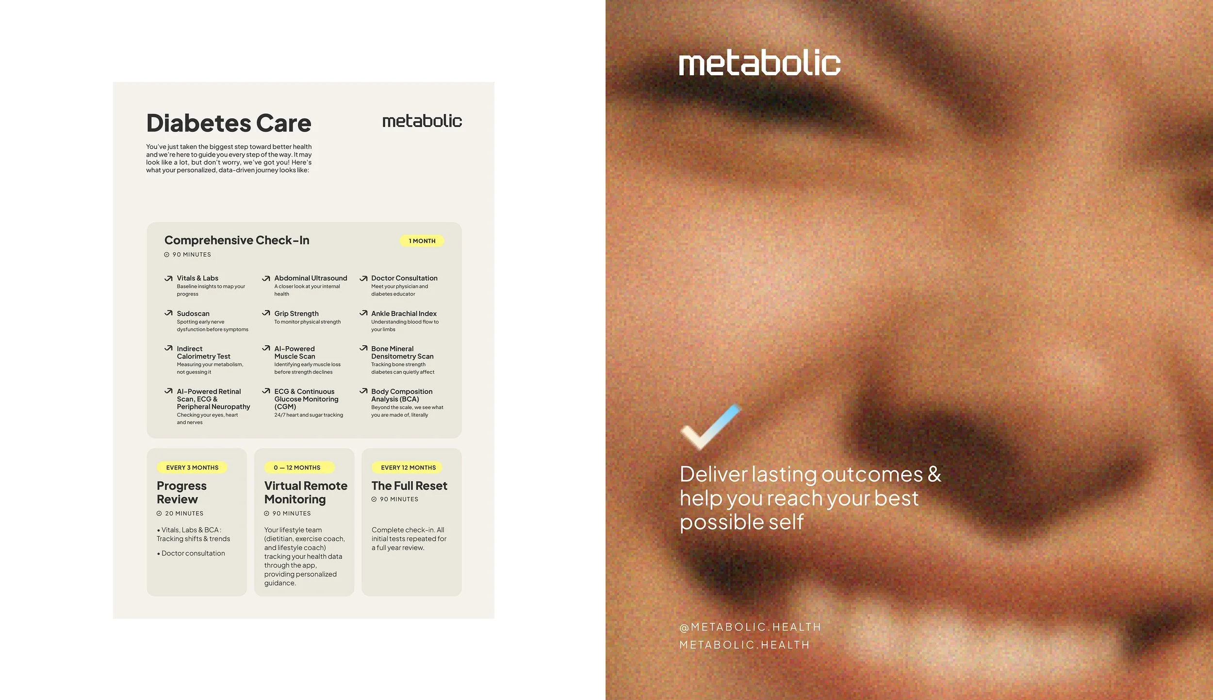
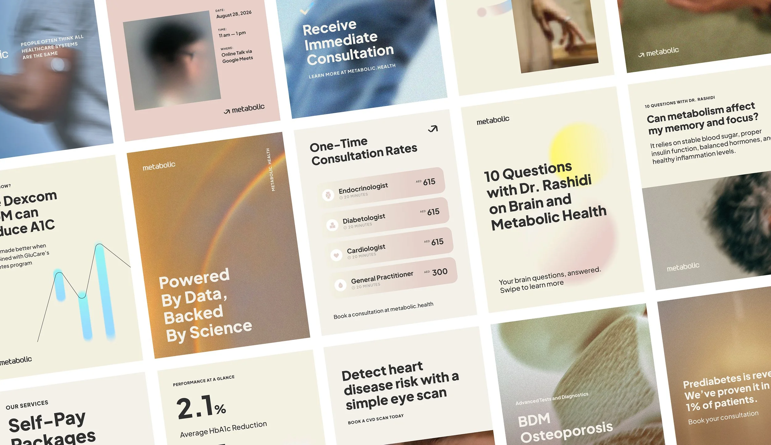
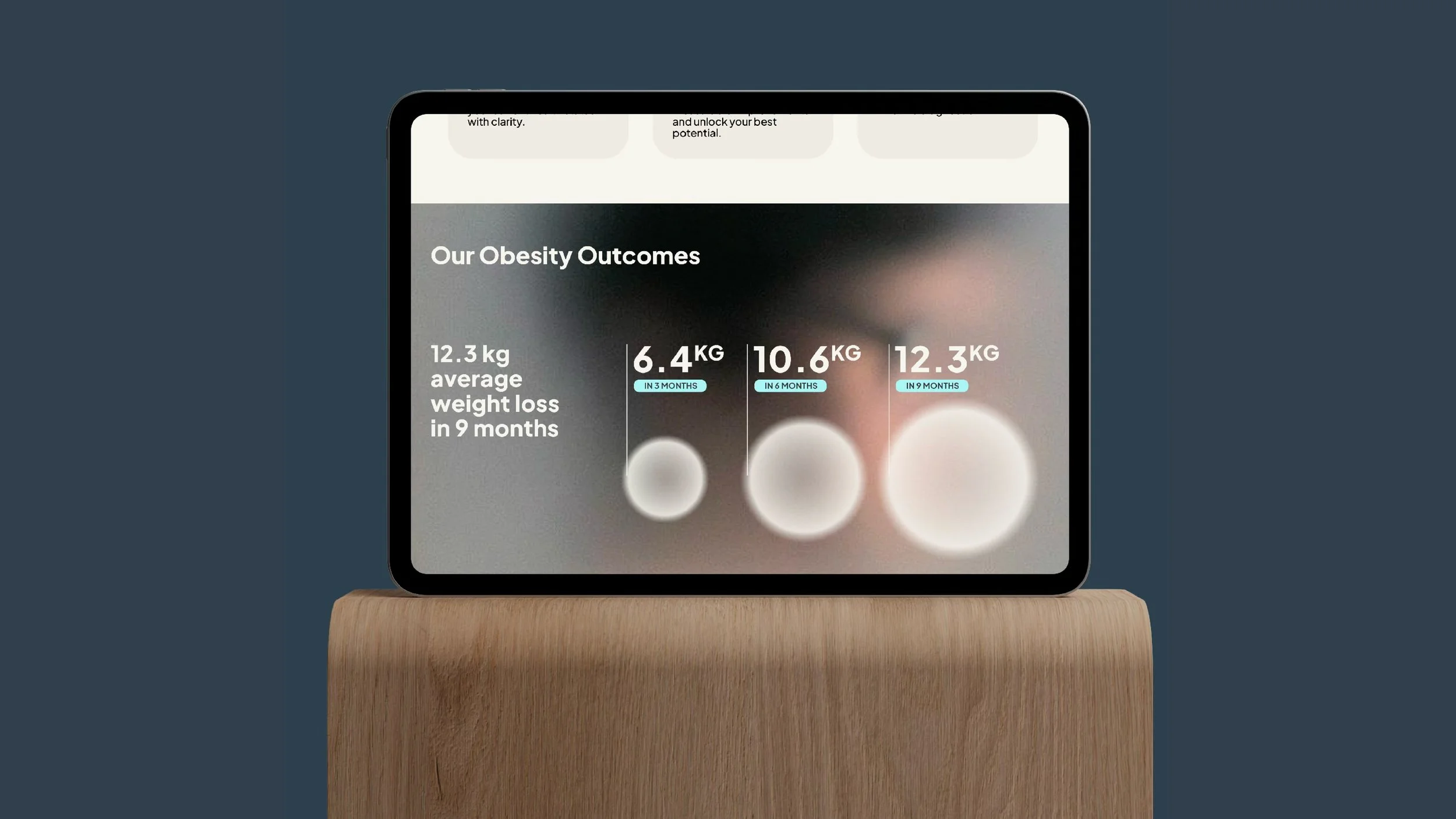
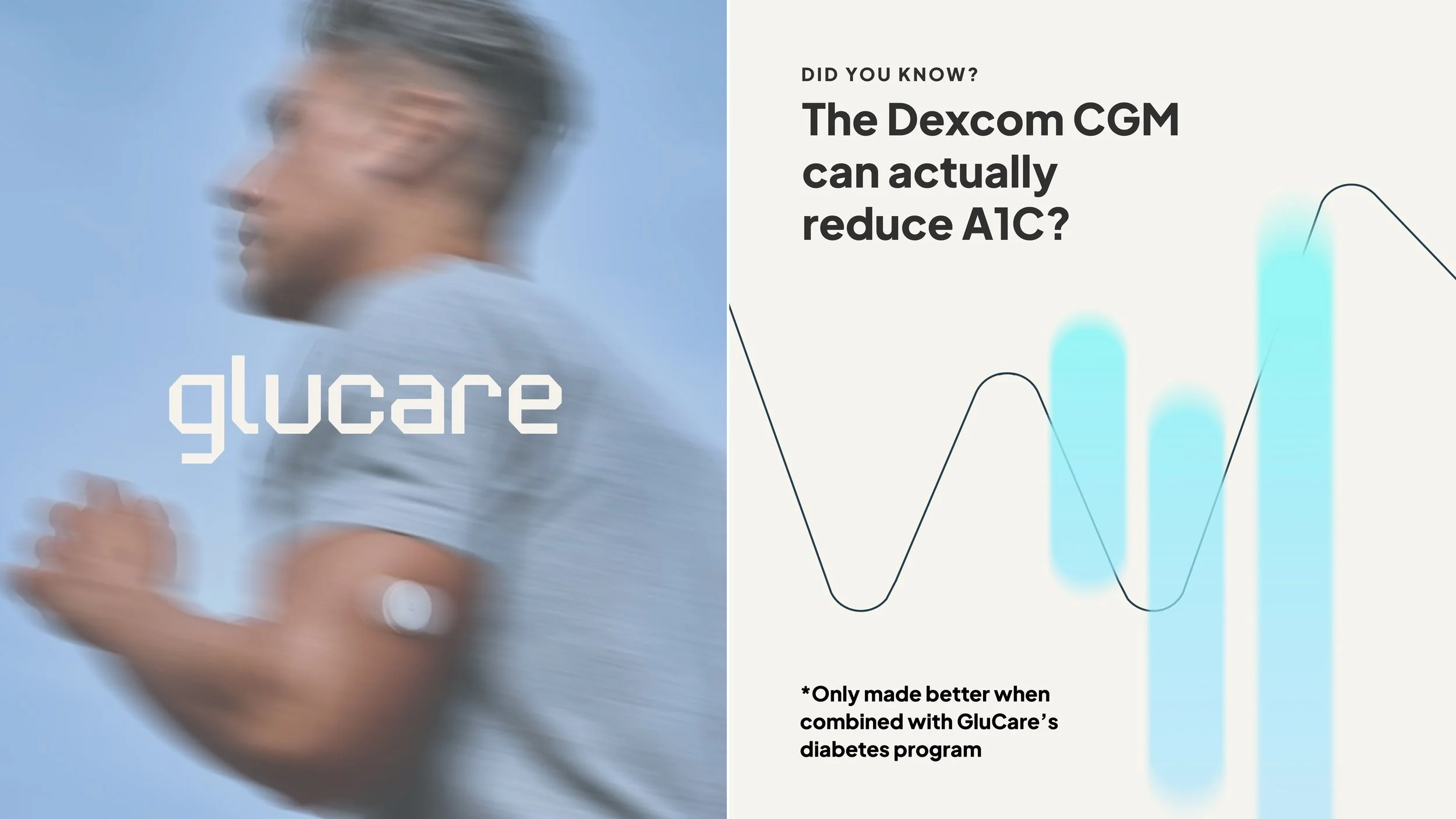
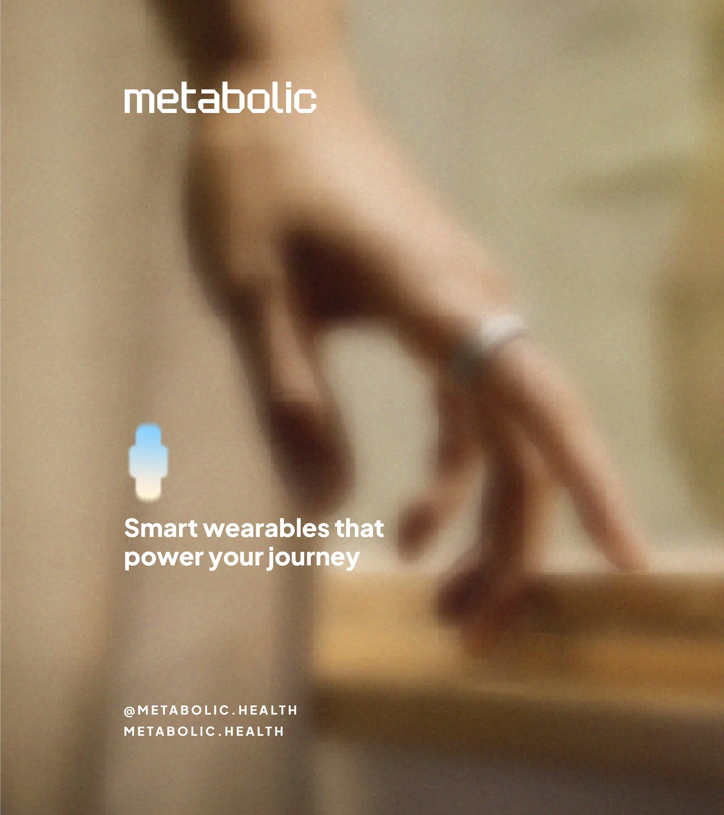
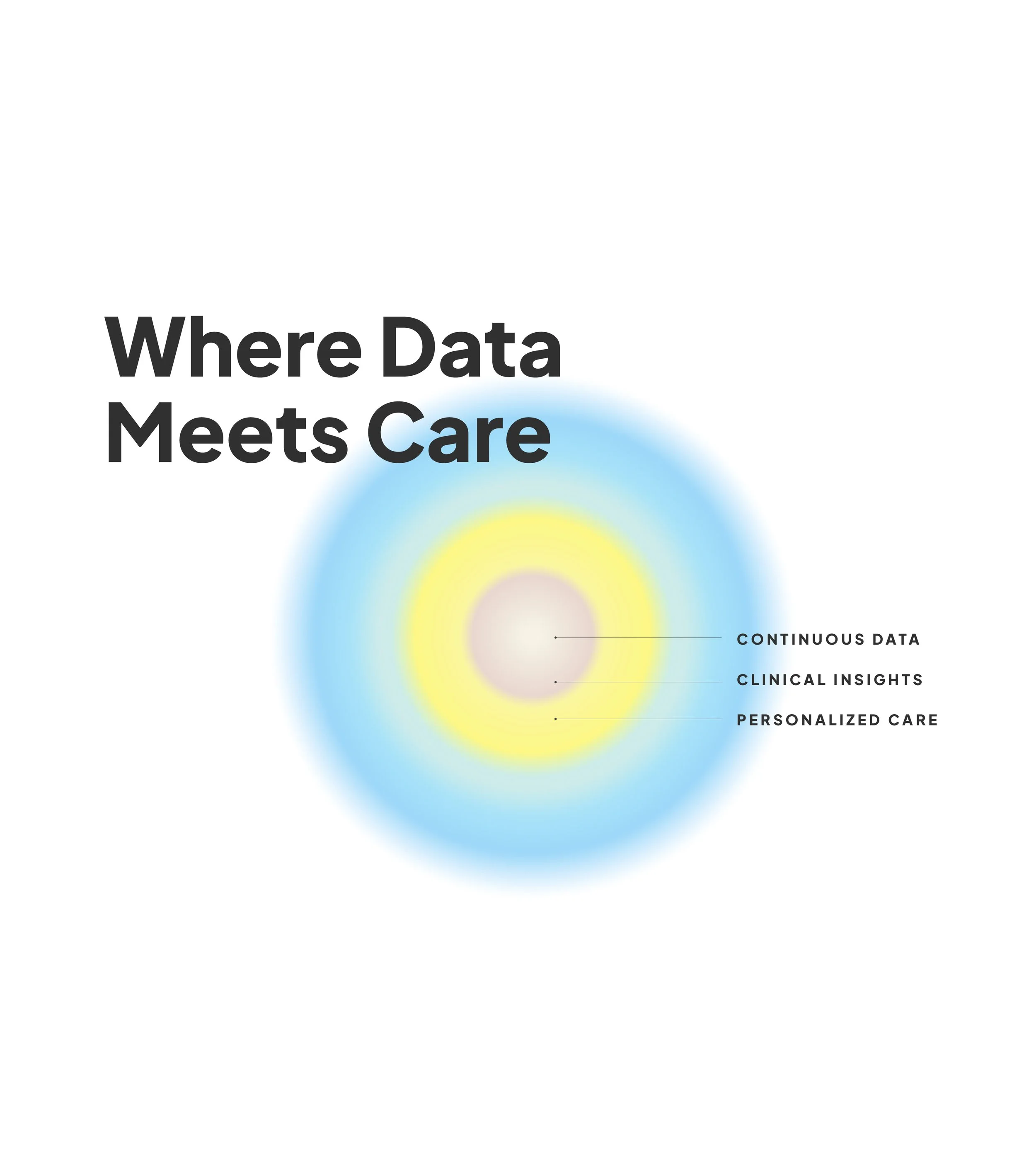
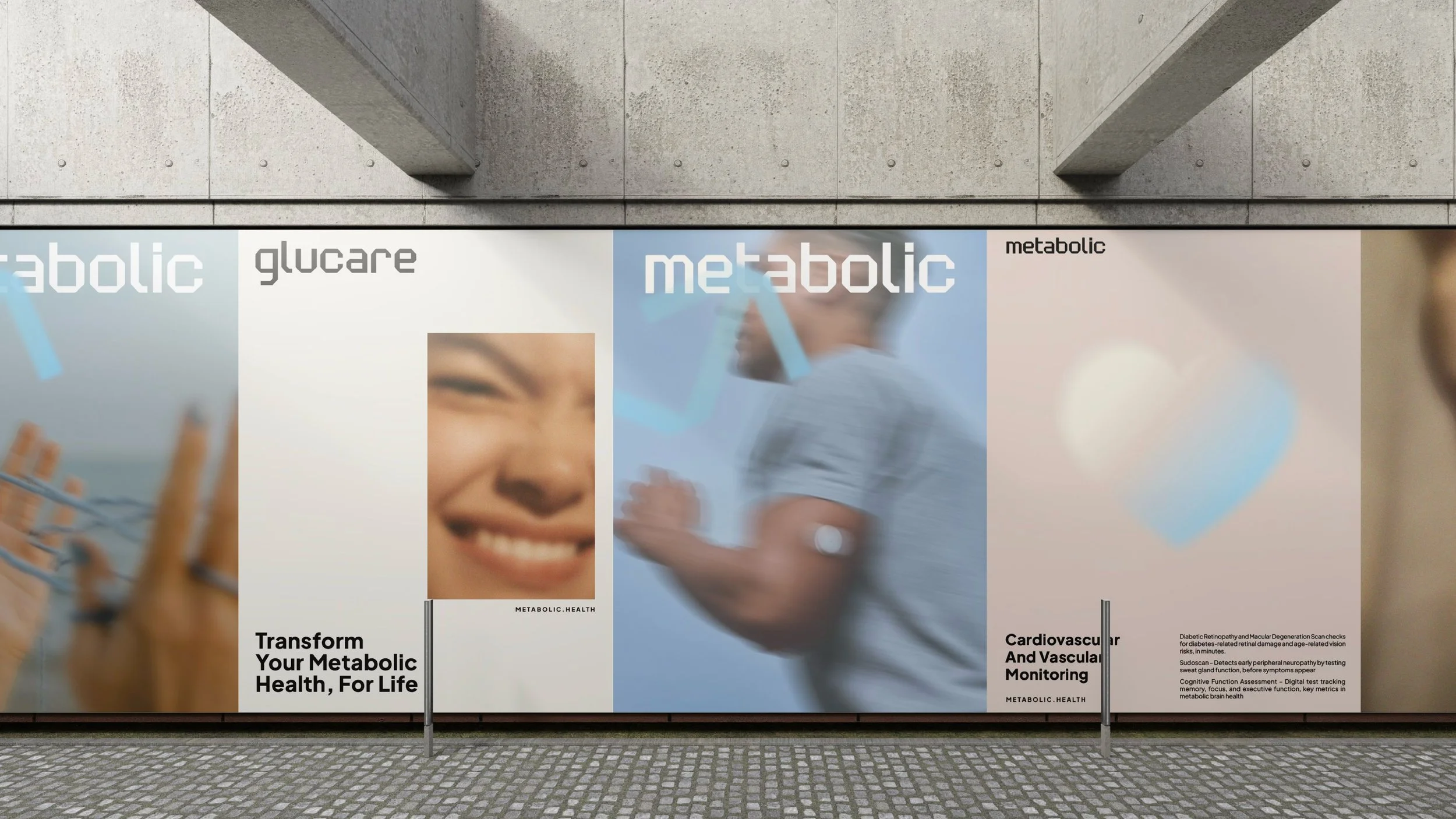
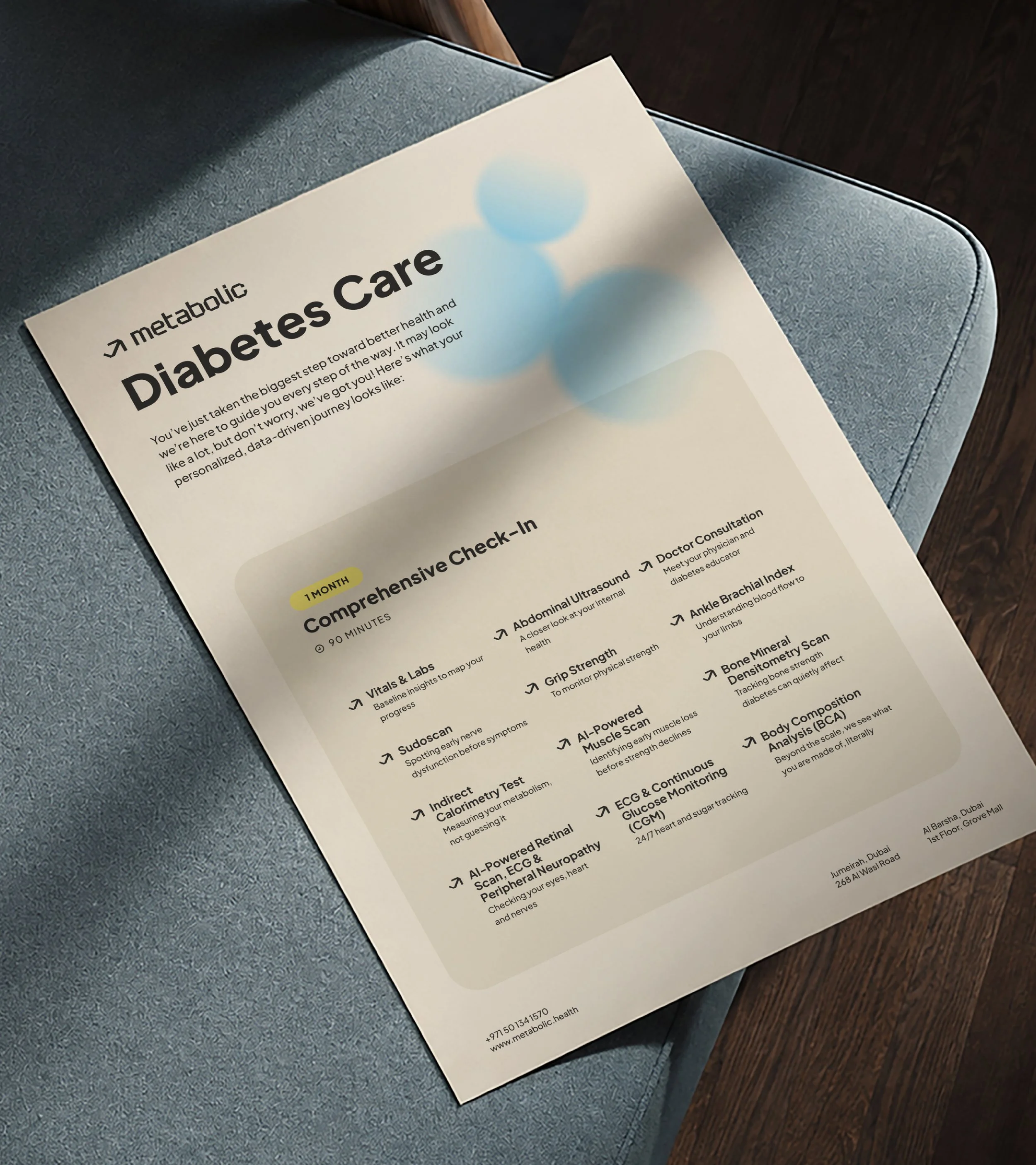
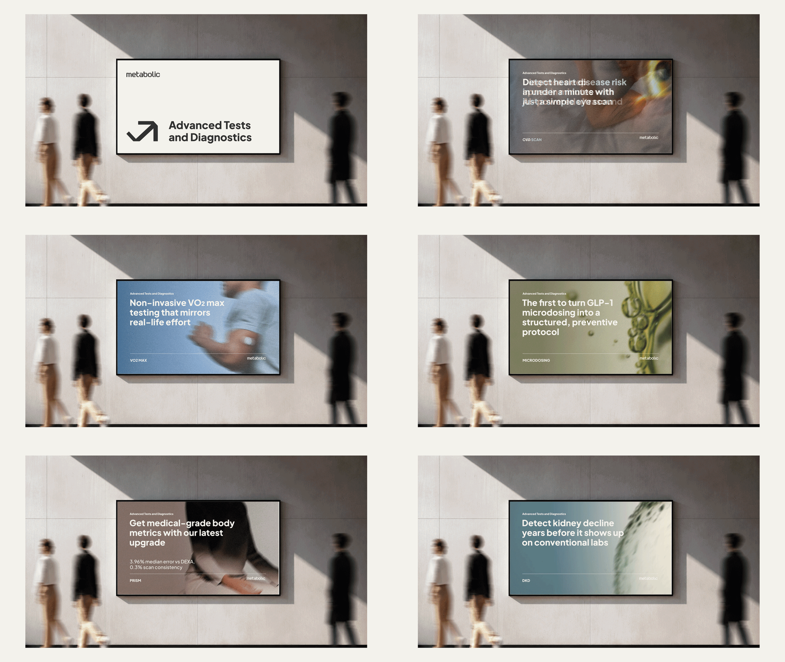
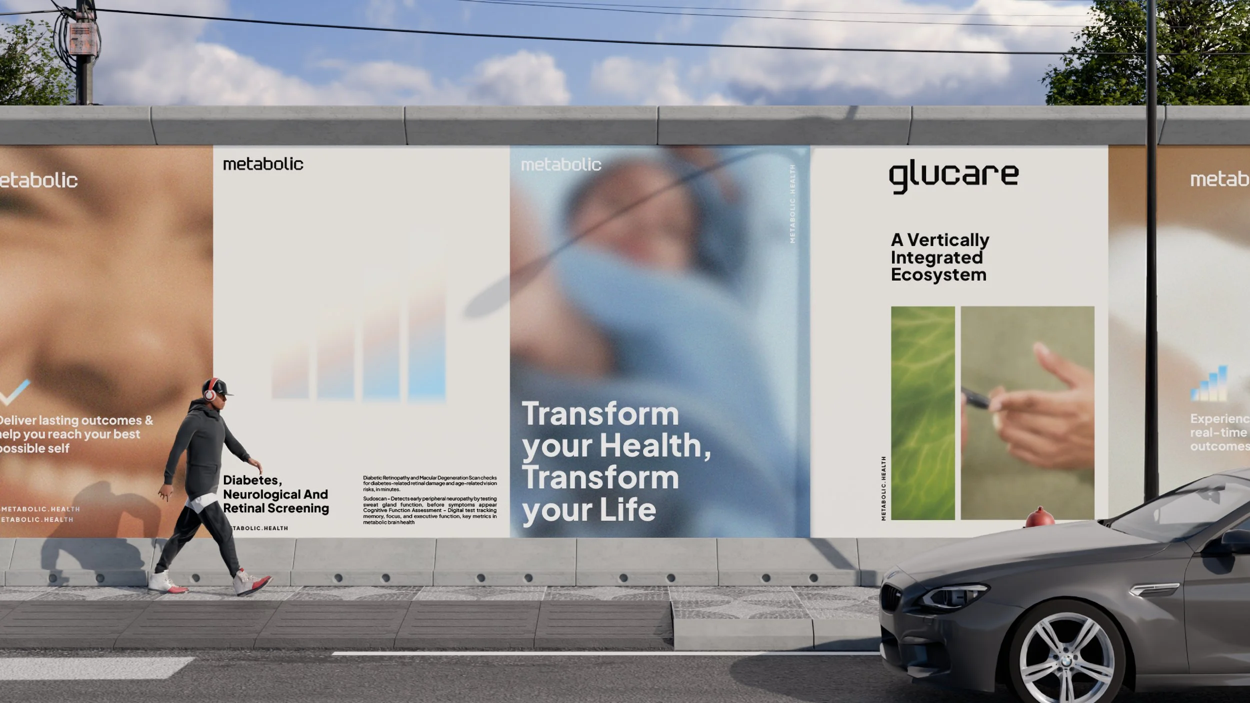
Across the wider identity, soft gradients, gentle transitions and calm colors create a sense of ease and focus. Compositions move from denser, more complex forms into increasingly open spaces, mirroring the experience Metabolic aims to provide: turning information into understanding, and understanding into smarter health decisions. The same visual thinking was extended to Glucare, the data and research-focused entity within the Metabolic ecosystem.
The result is an identity that feels precise without being clinical, technological without being cold, and clear without oversimplifying - a visual system designed to make better health easier to navigate.
Rebranding, Bilingual Identity, Stationary & Brochure, Social Media, In-screen
Industry: Medical
Year Completed: 2026