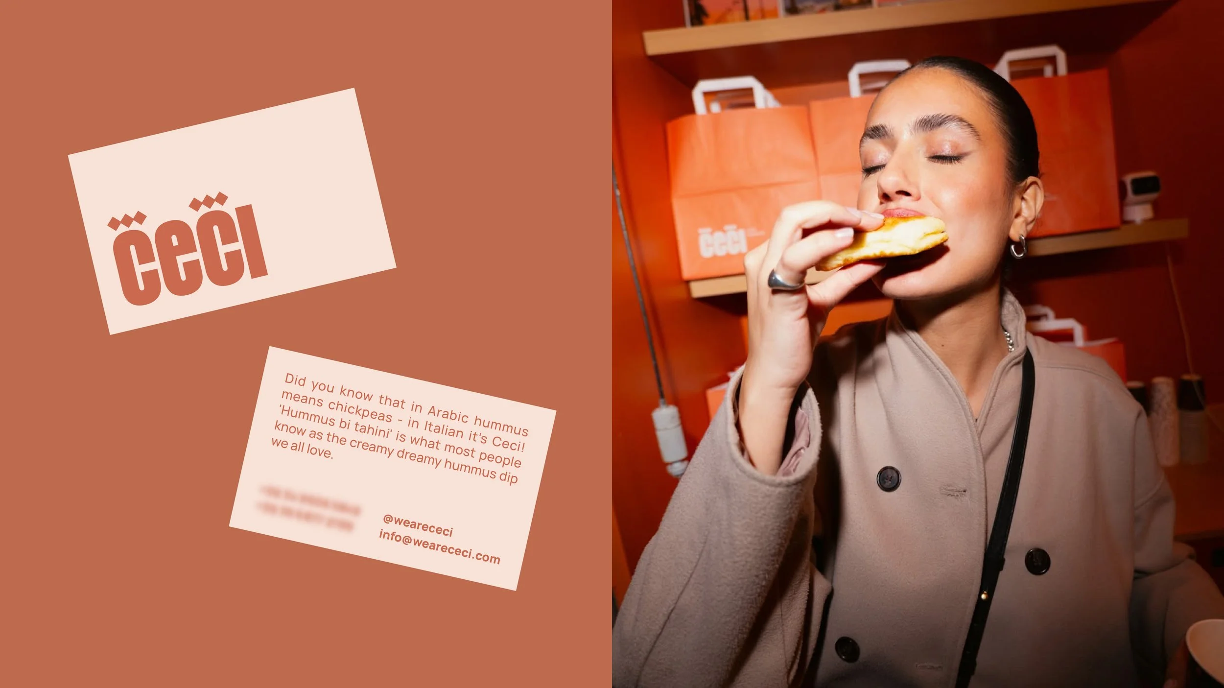
CECI Casa Libanese
Strategy, Branding, Art Direction, Packaging, Space Design, Menu Design
Industry: F&B
Year Completed: 2025
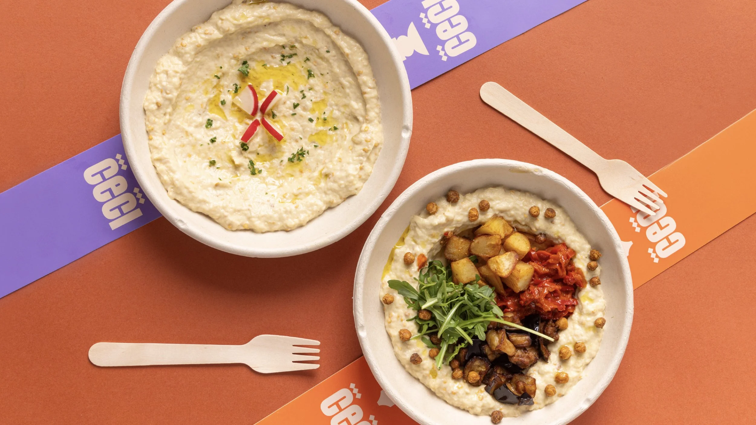
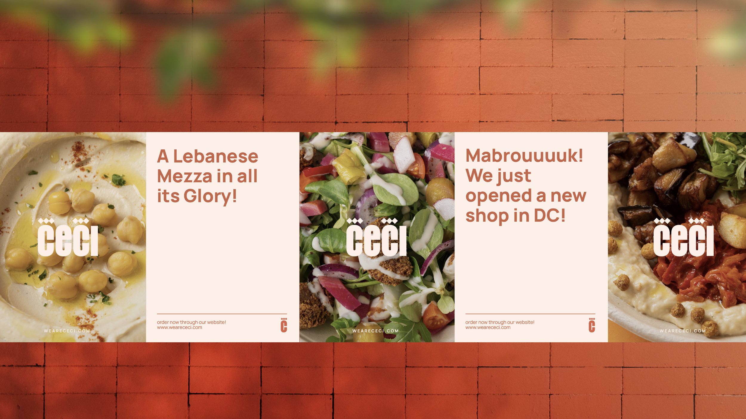
CECI is a contemporary Lebanese fast-food concept designed for movement.
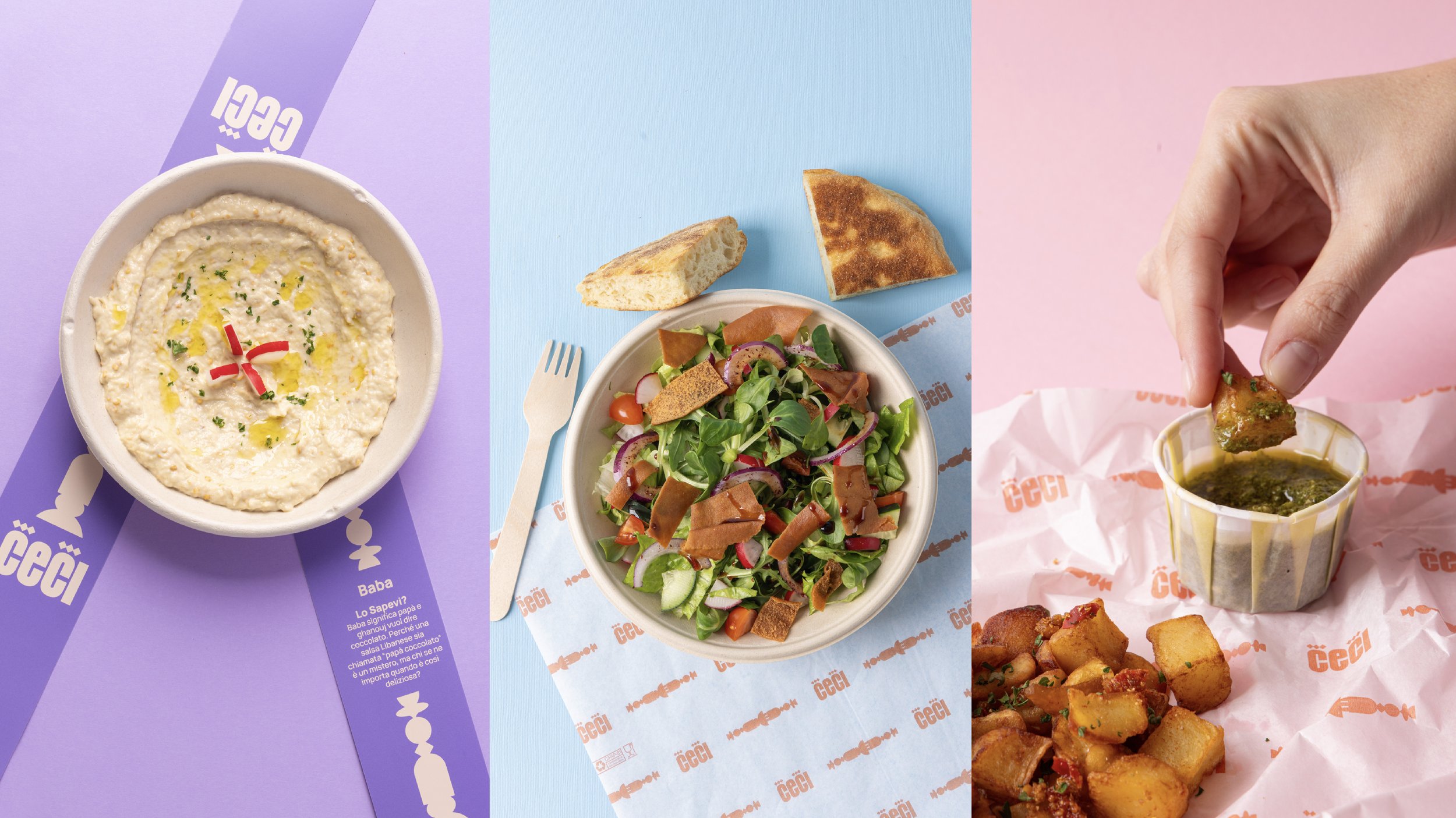
We positioned the brand as healthy fast food without compromise - simple, wholesome Lebanese flavors made for everyday life. Our work covered strategy, branding, packaging and space design, shaping a concept that bridges cultural heritage with modern habits and allows Lebanese mezze to live comfortably in an urban, grab-and-go context in Milan.
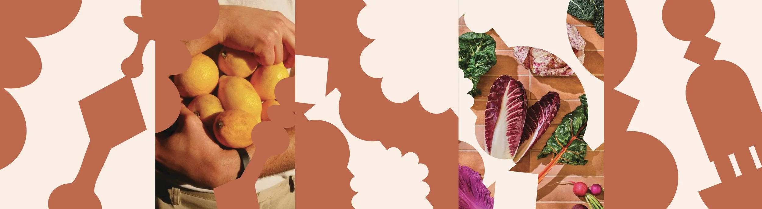
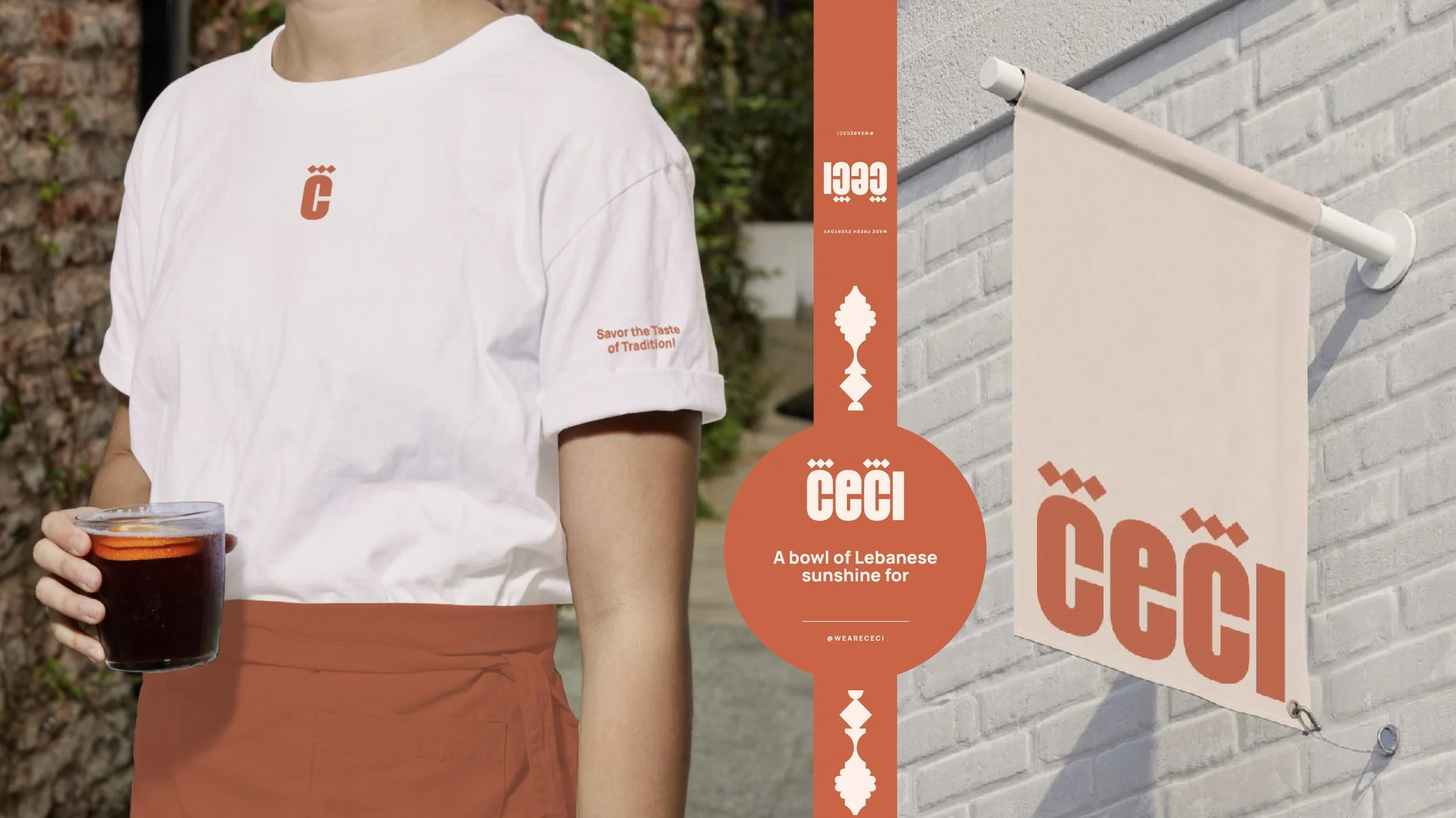
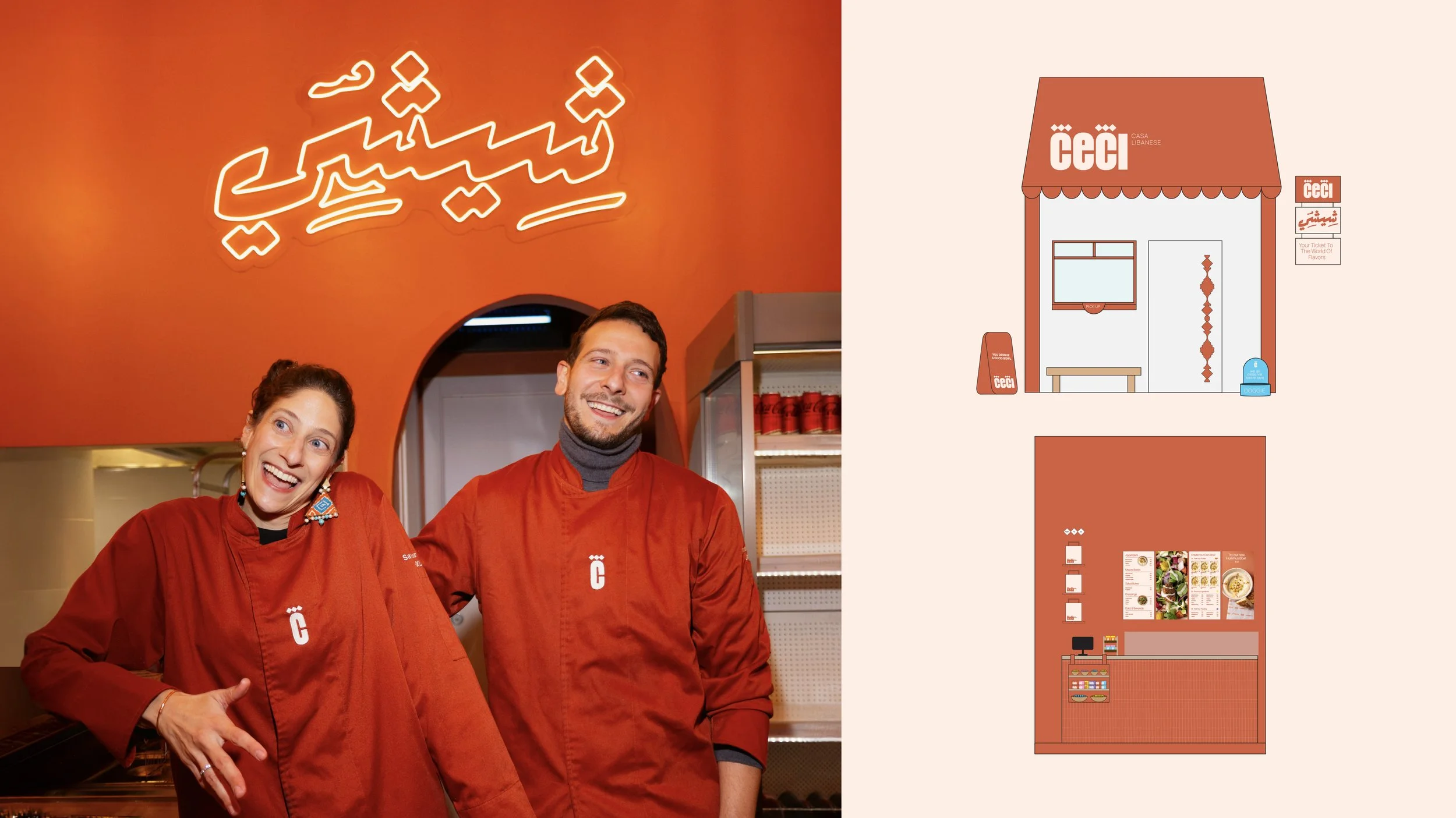
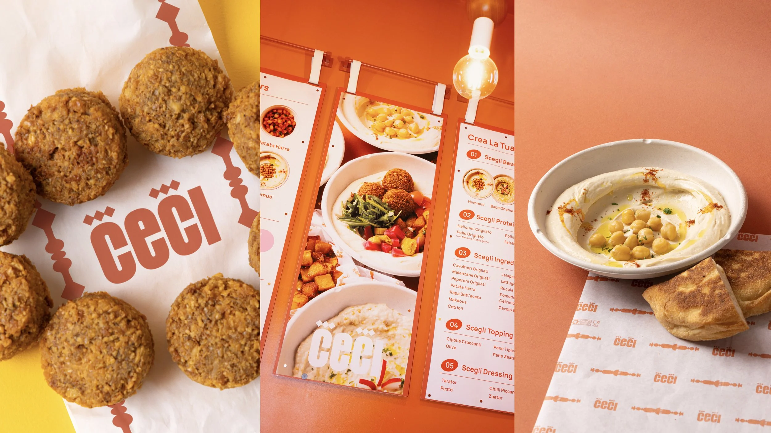
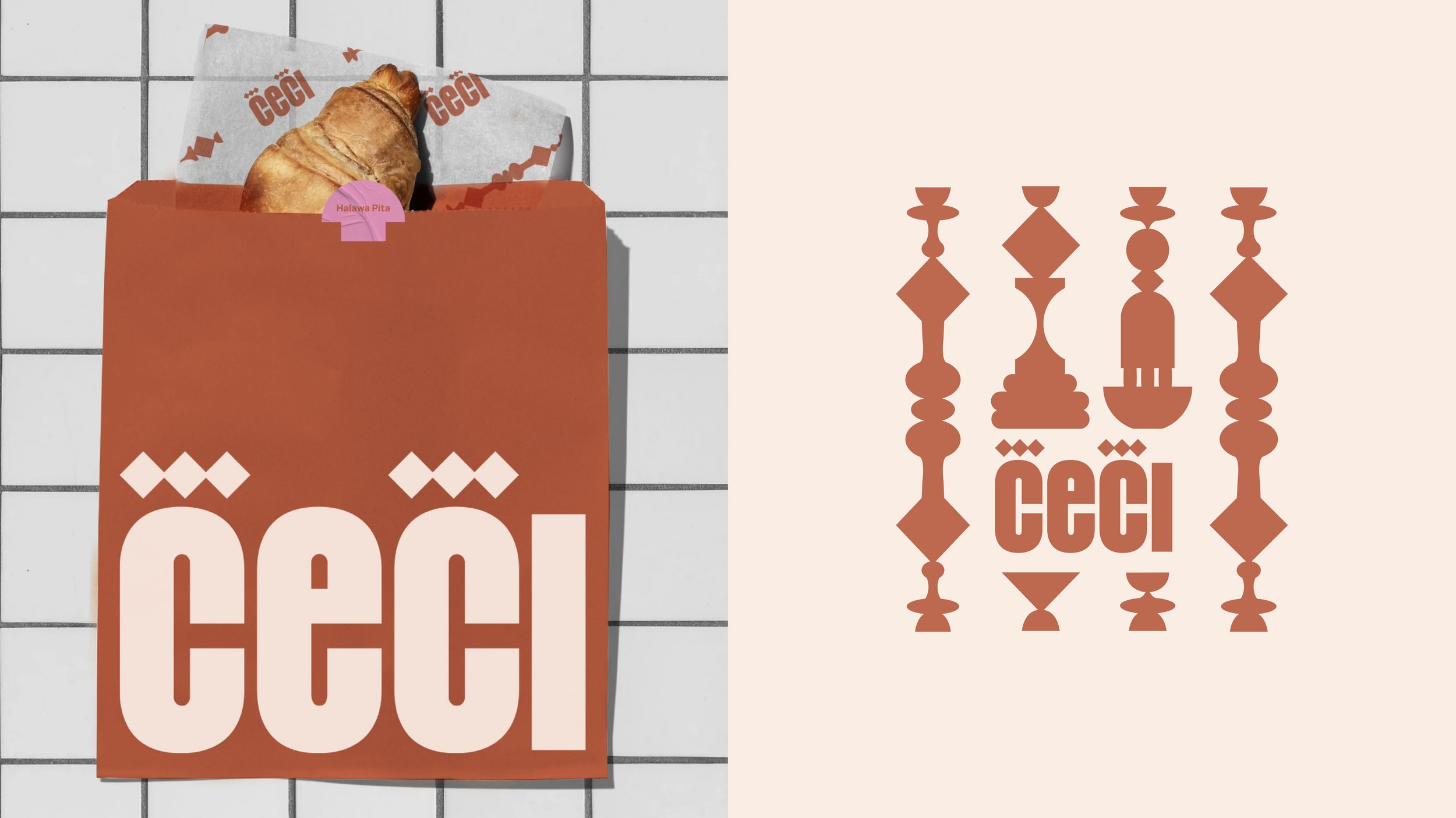
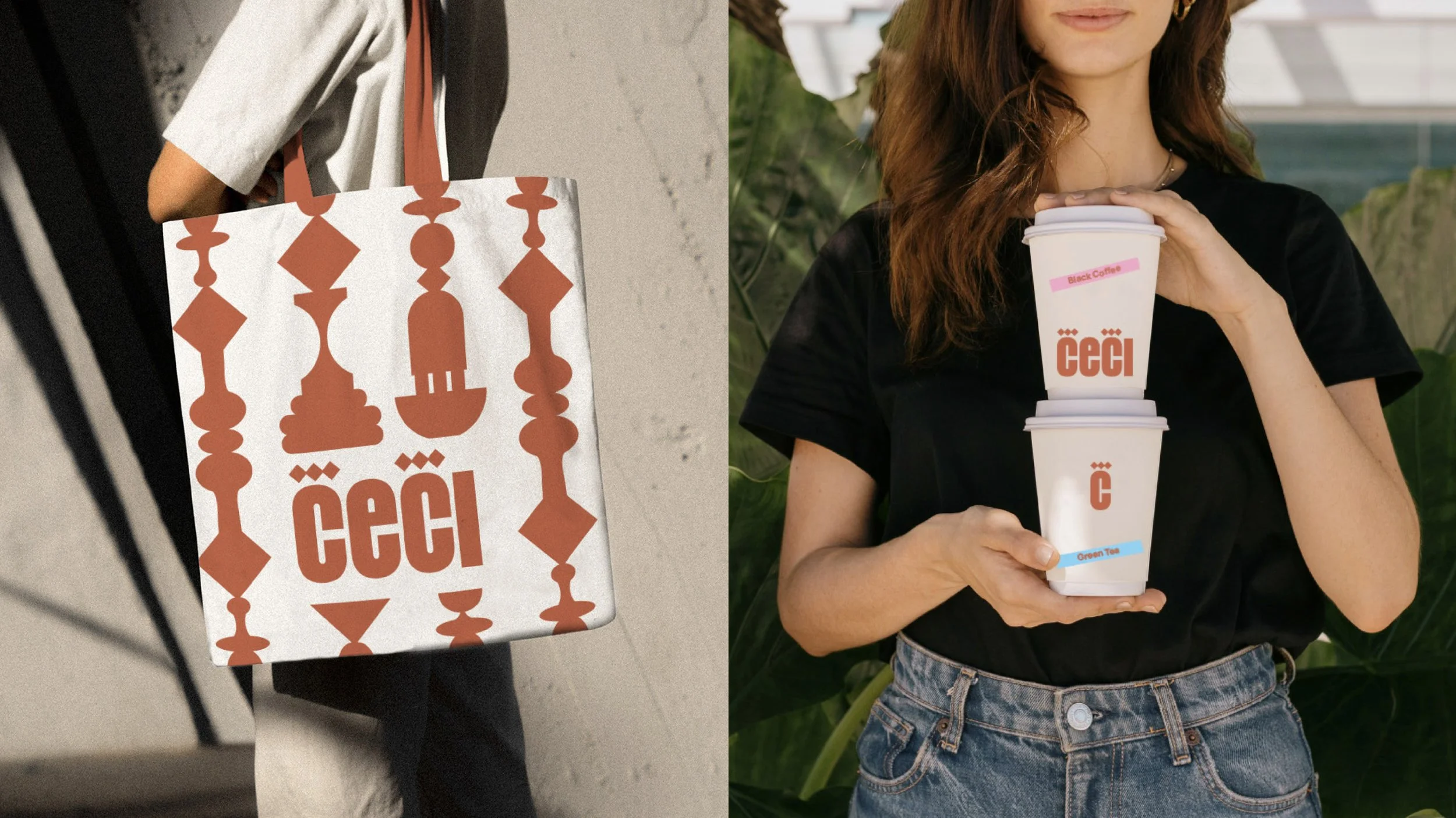
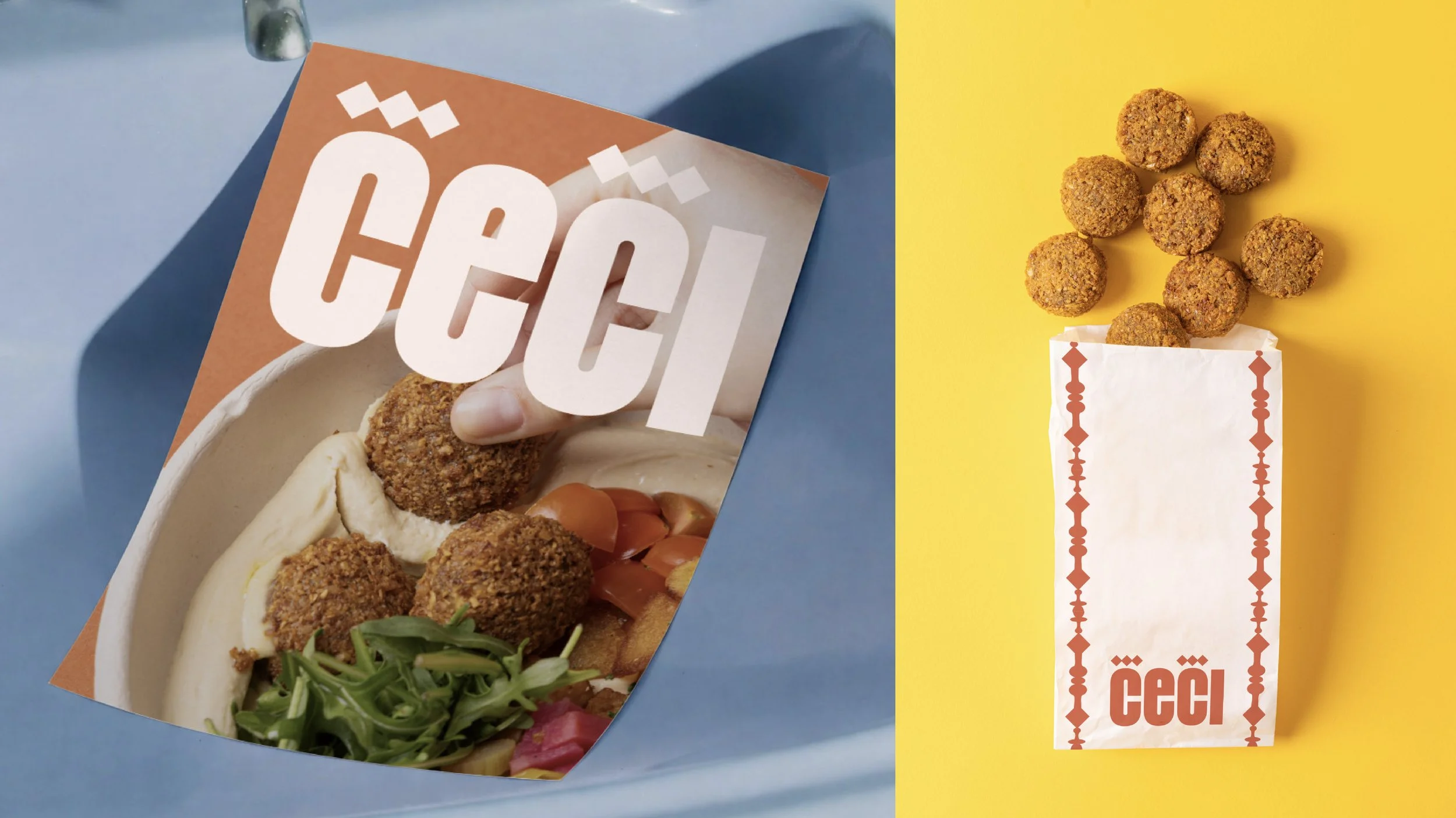
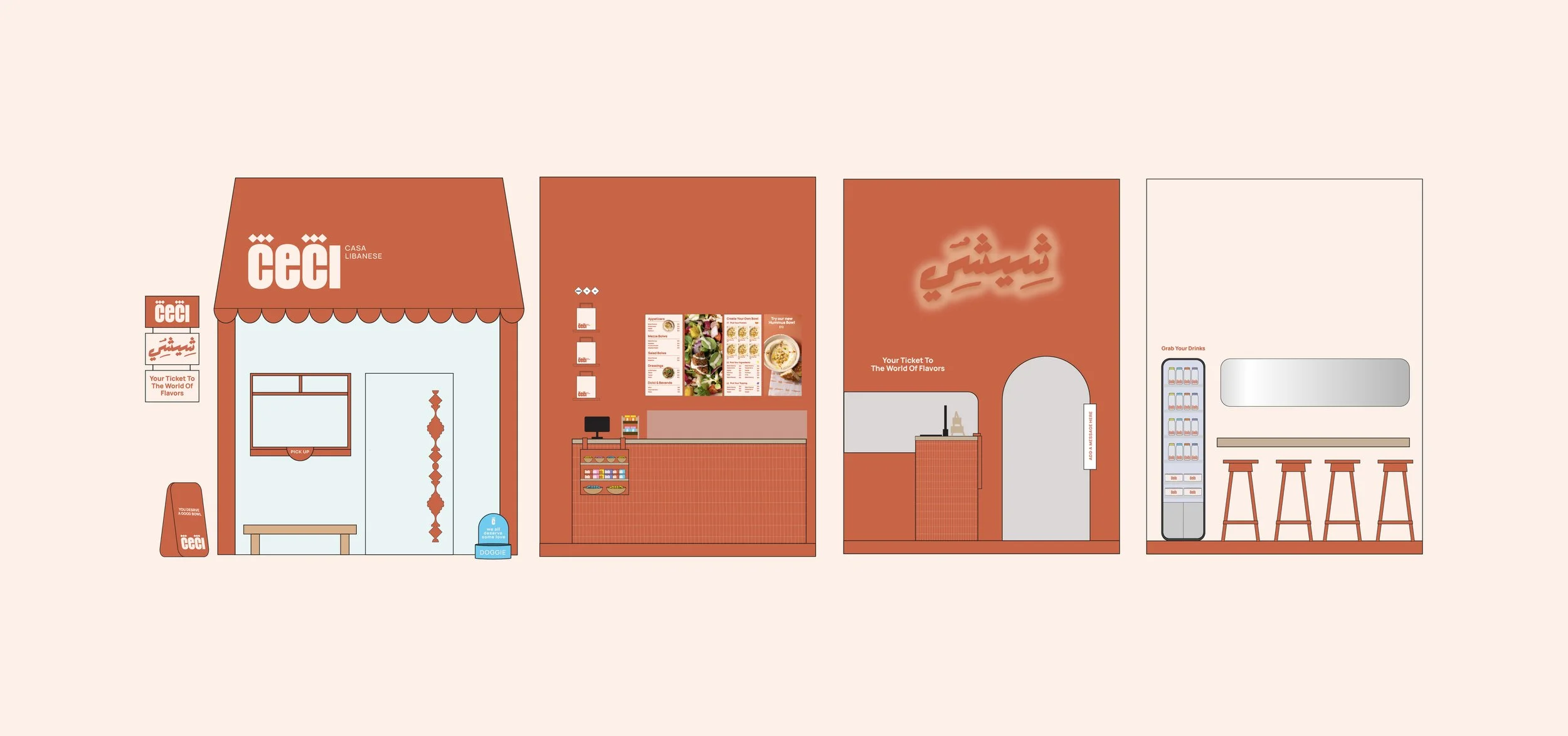
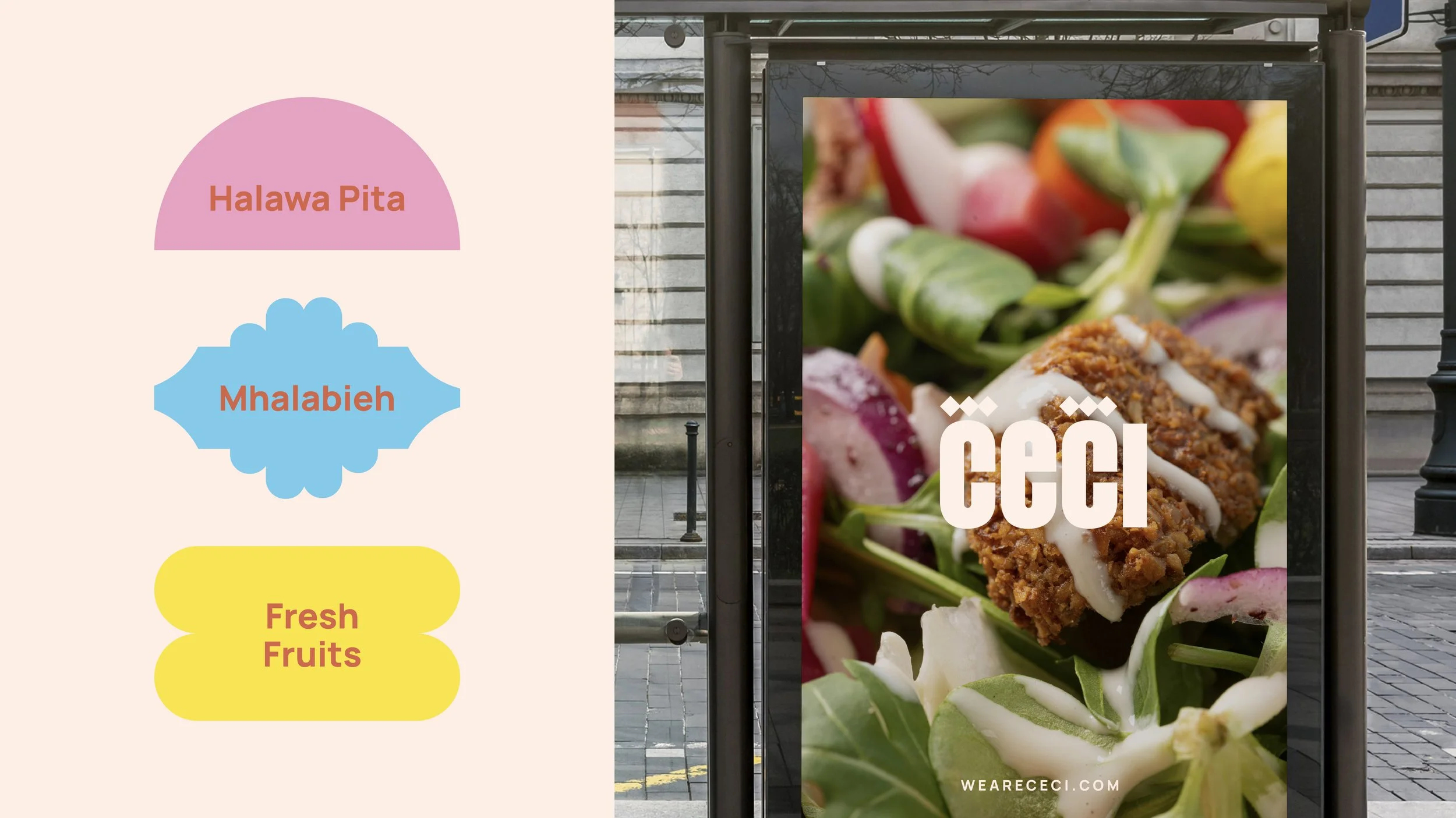
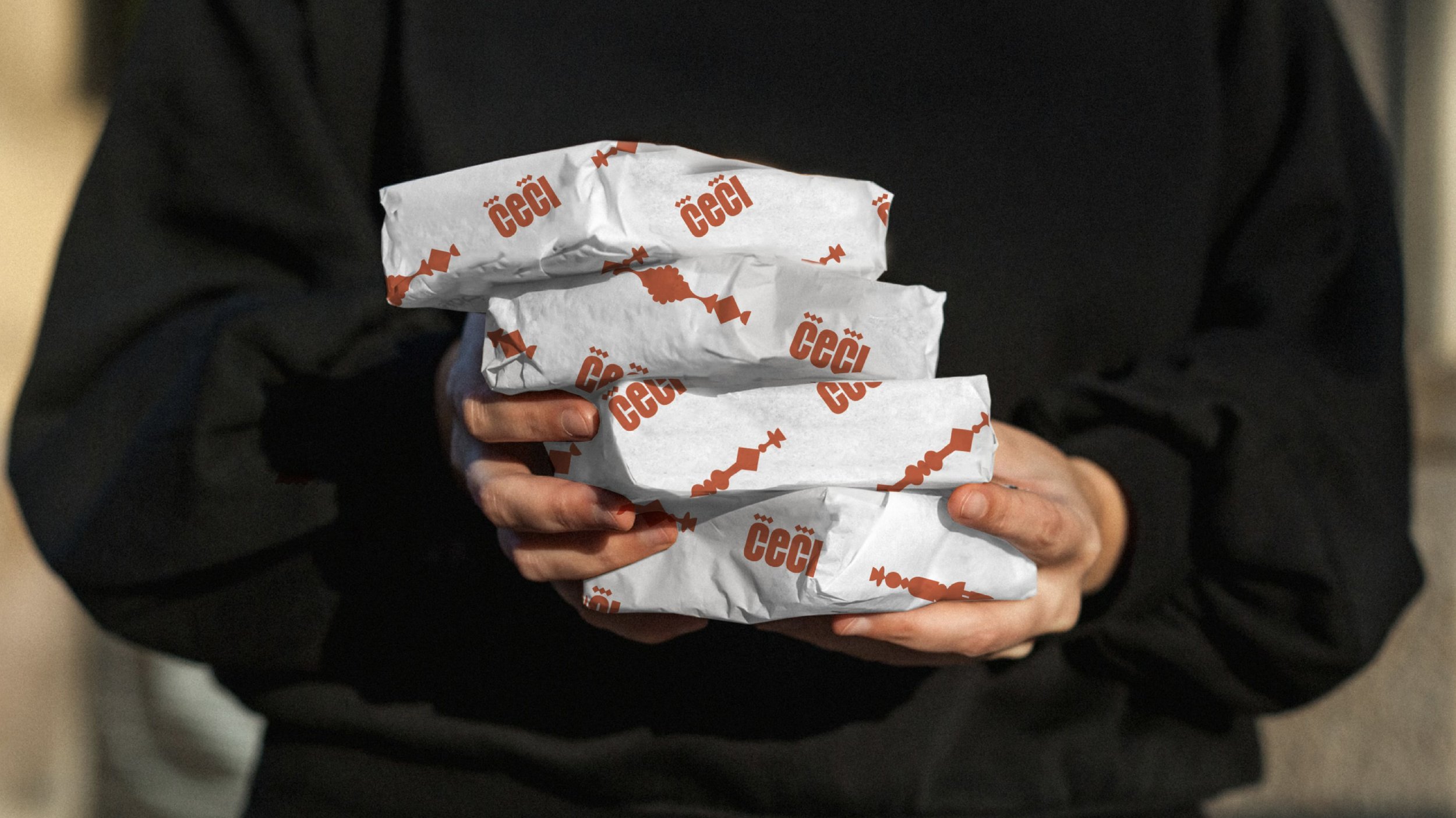
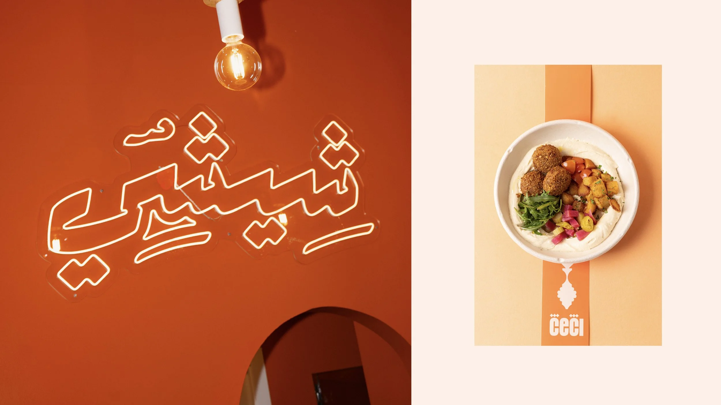
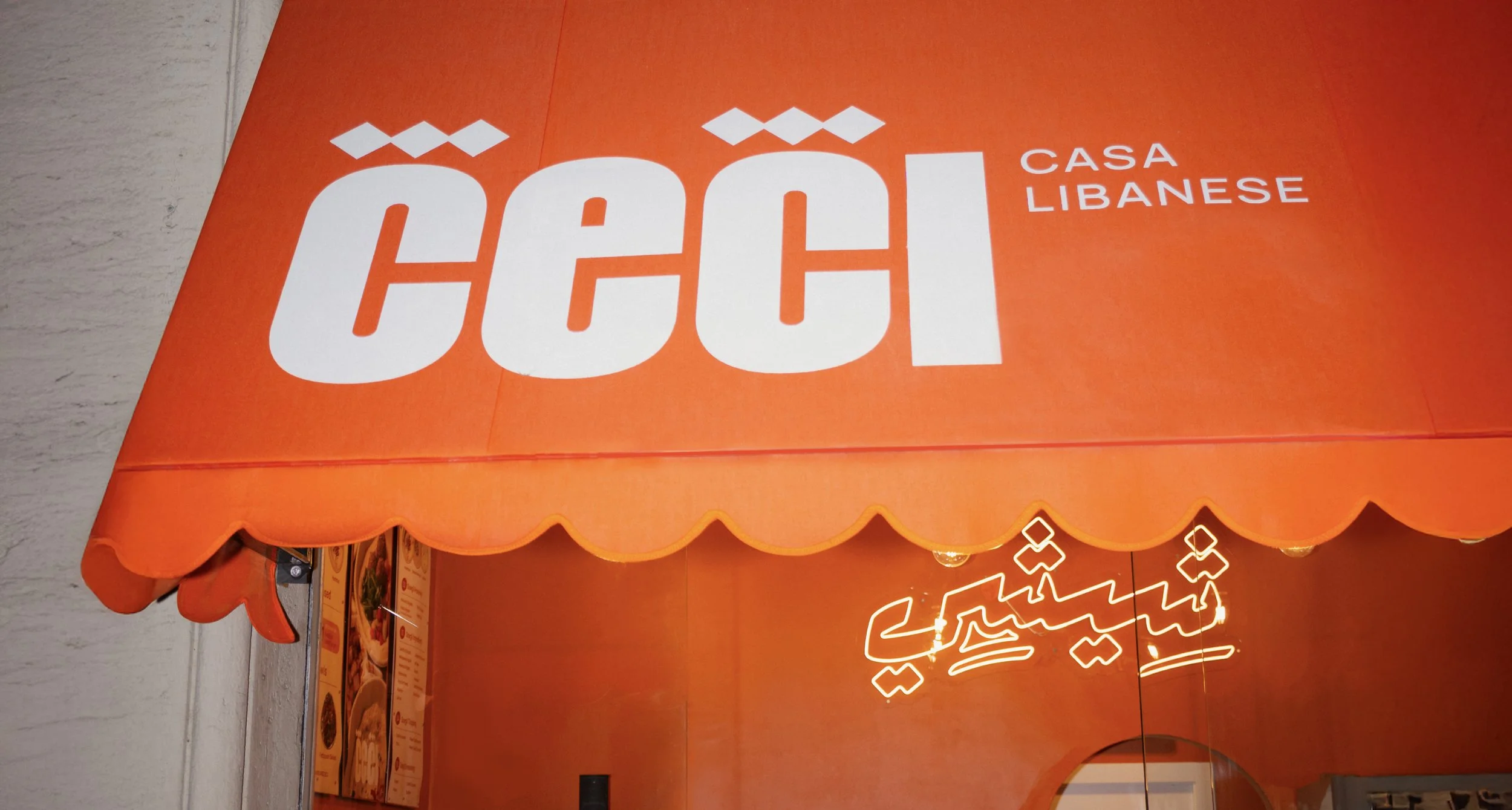
Inspired by the architecture of traditional Lebanese houses - their arches, columns, and rhythm - the visual identity was translated into a modern, flat 2D graphic language. The logo is set in a bold sans-serif typeface for strength and clarity, with the three dots of the Arabic letter ش (shin) subtly integrated into the Latin letter C to improve legibility while adding movement and a cultural wink.
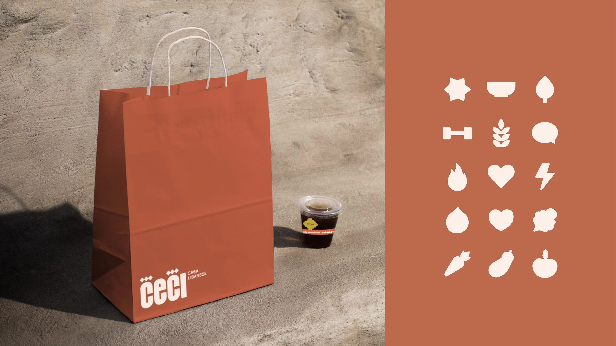
Orange was chosen as the core color to express freshness, energy, and healthy fast food, while the interior layers different shades and textures of orange to create depth and an immersive, highly visible space that stands out from the street through its fully glazed façade.
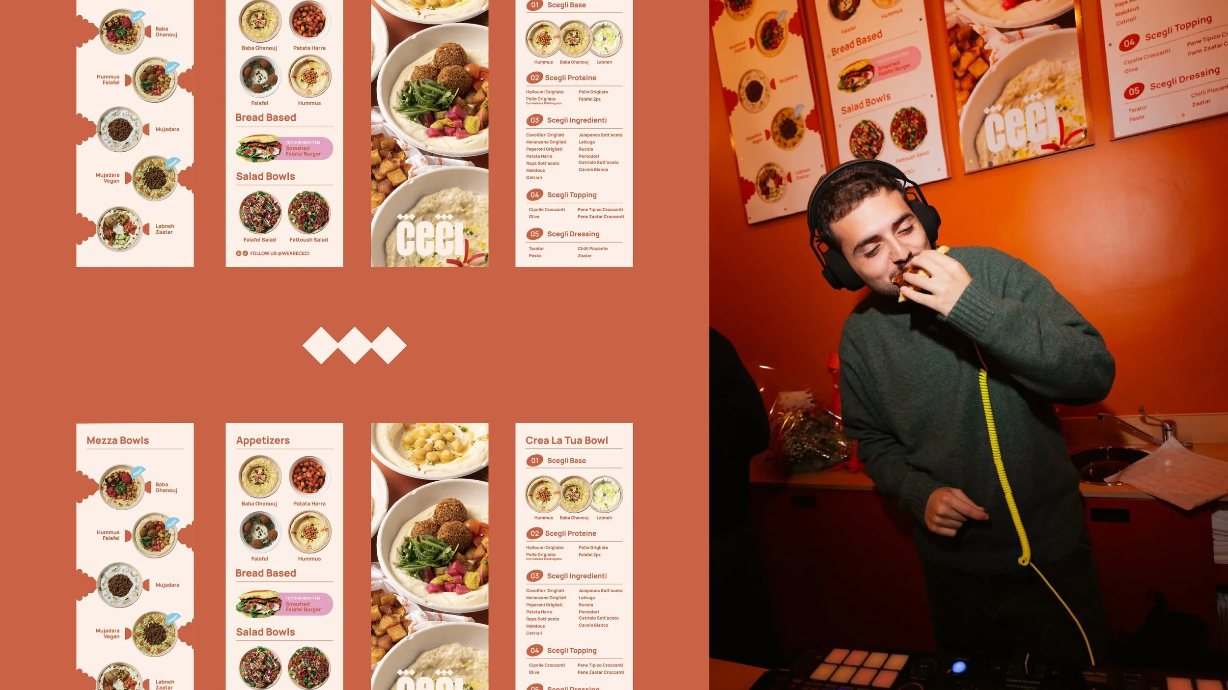
Packaging and menu design were treated as visual tools first, using bold typography and strong imagery to create an intuitive, fast experience with minimal text and maximum clarity. The graphic shapes and visual language are used as image placeholders, packaging die-cuts, and decorative elements across all touch points whenever needed.