Moe Swidan
Branding, Communication, Website, Merchandise, Social Media Template
Industry: Business
Year Completed: 2025
Credits: Website Development by Khalil Antoun
Moe Swidan is a life and business coach helping individuals navigate what’s next with clarity, structure, and purpose.
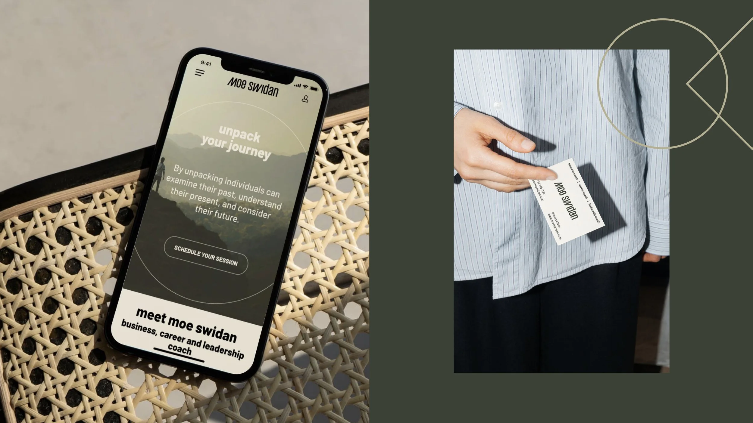
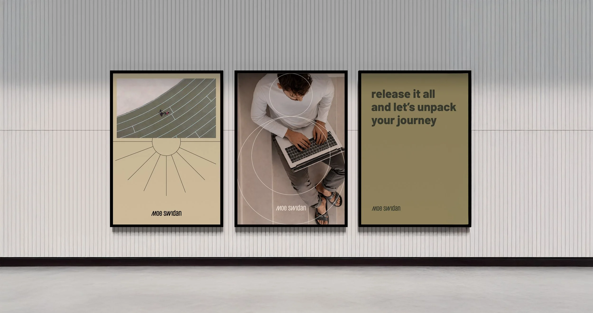
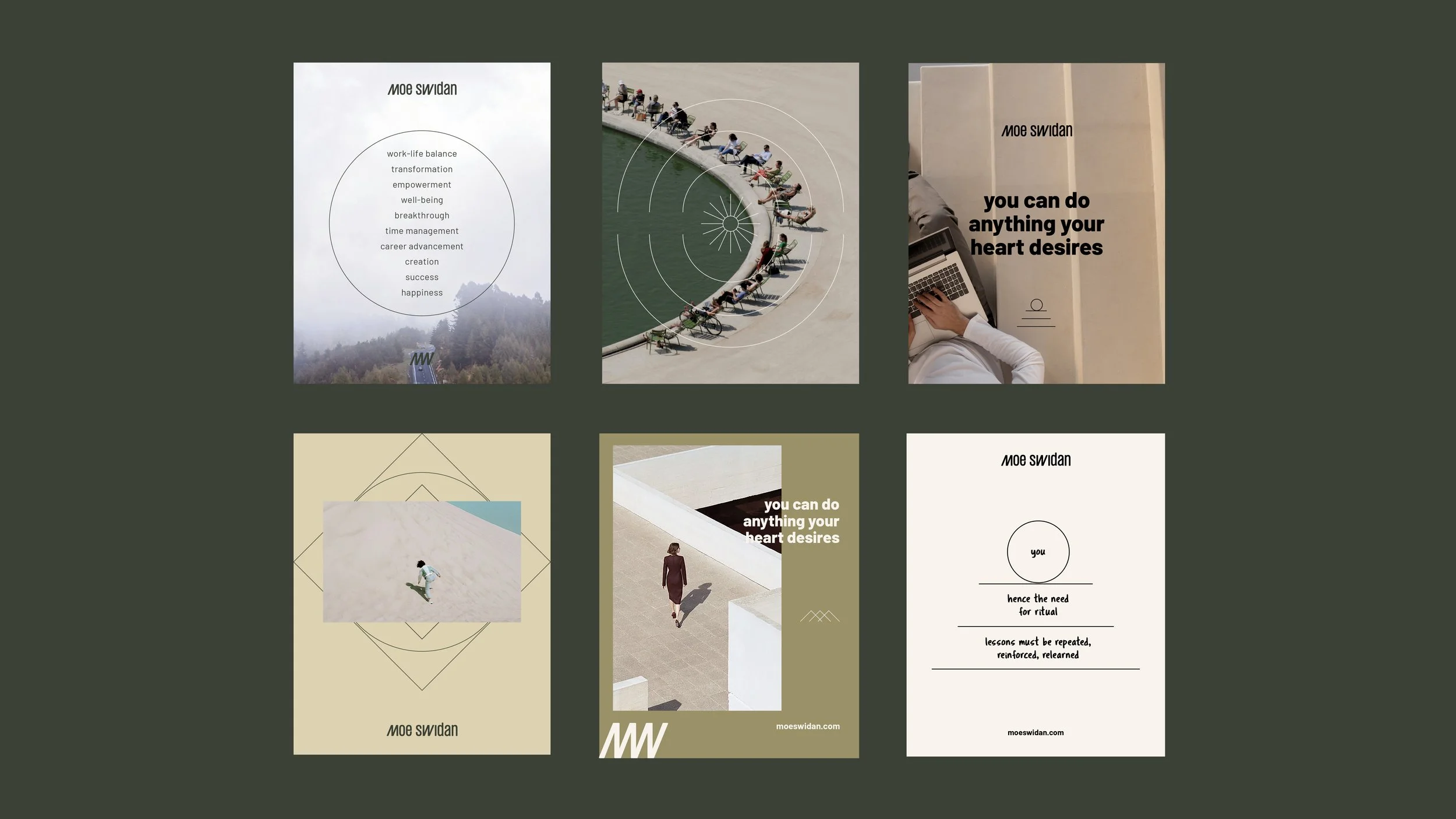
For this project, we crafted a brand identity rooted in progress, direction, and intentional movement. The visual language is deliberately minimal, built on fine lines and essential forms that express the relationship between where you are and where you’re going.
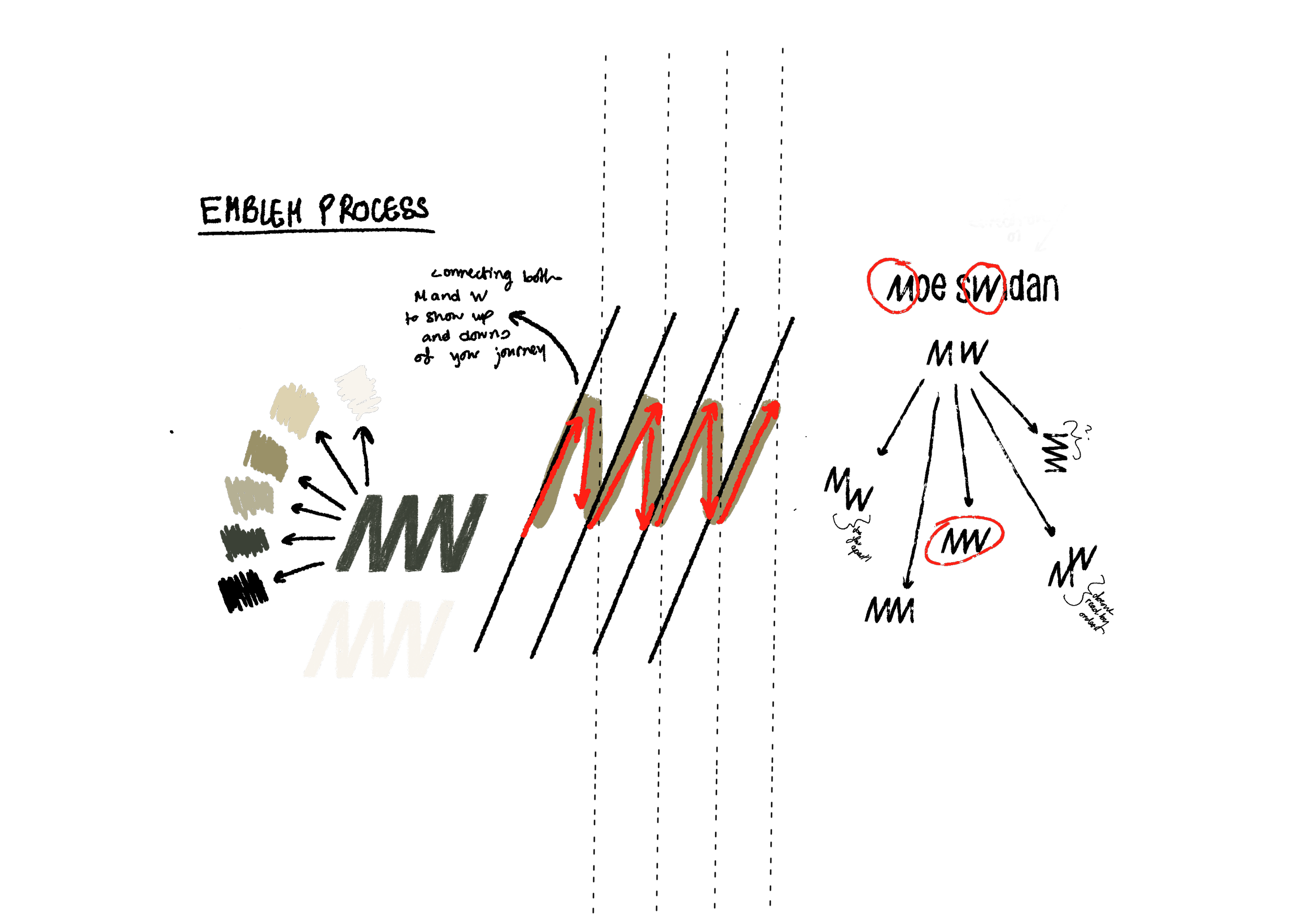
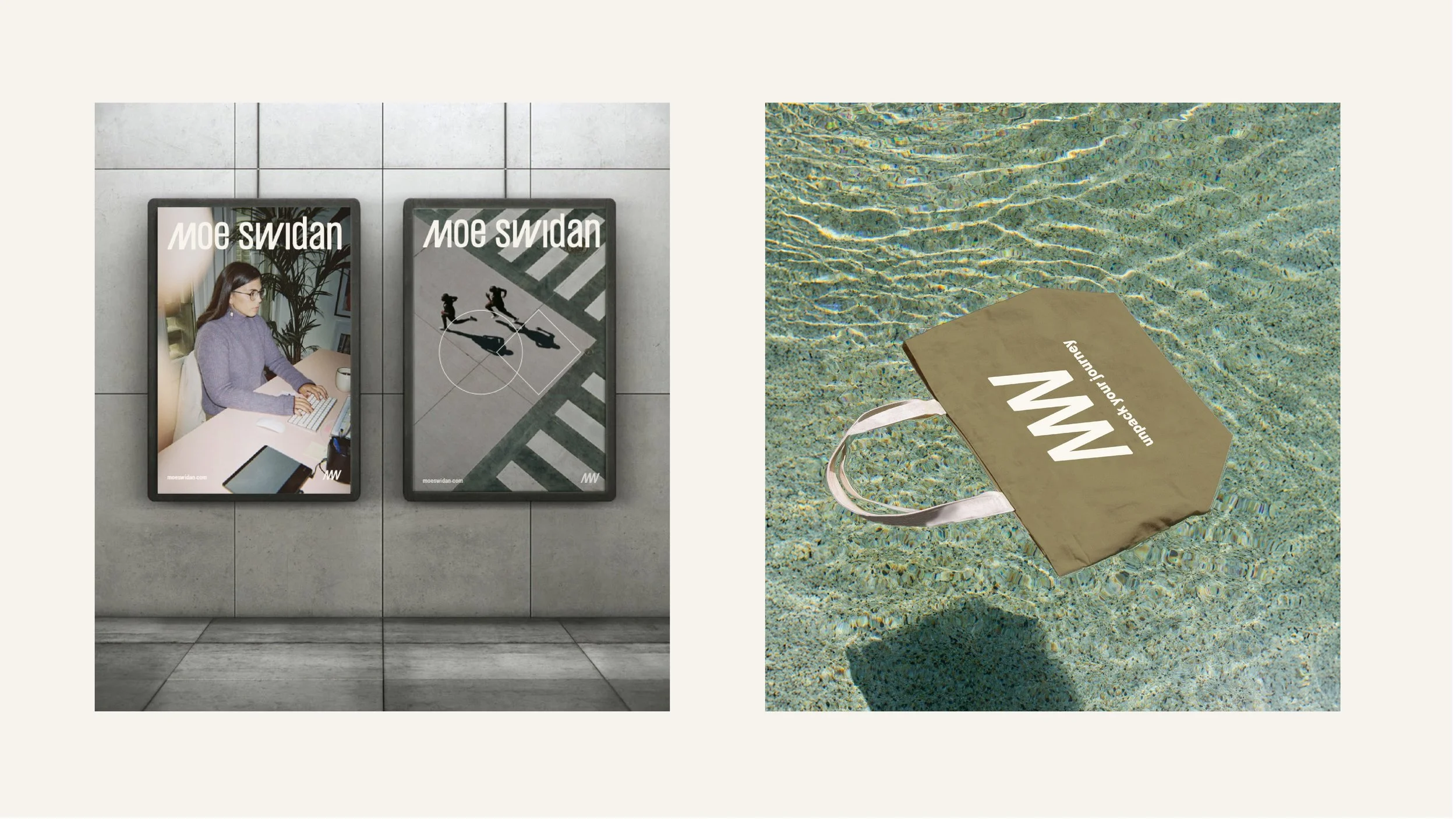
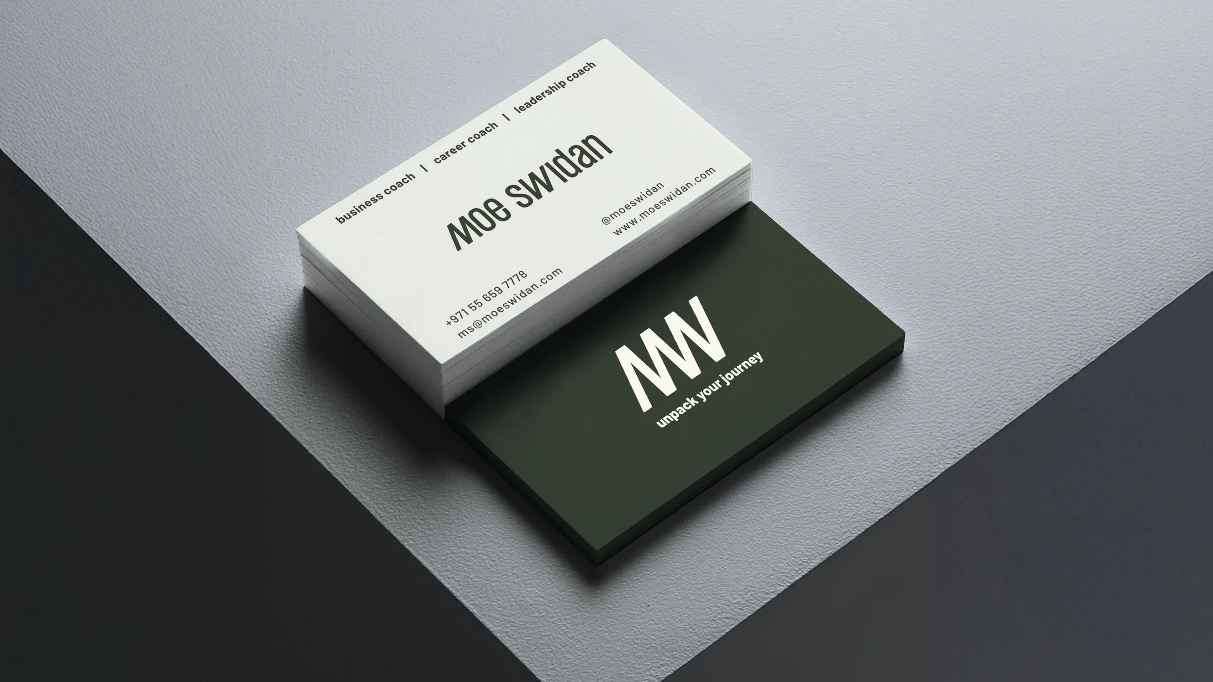
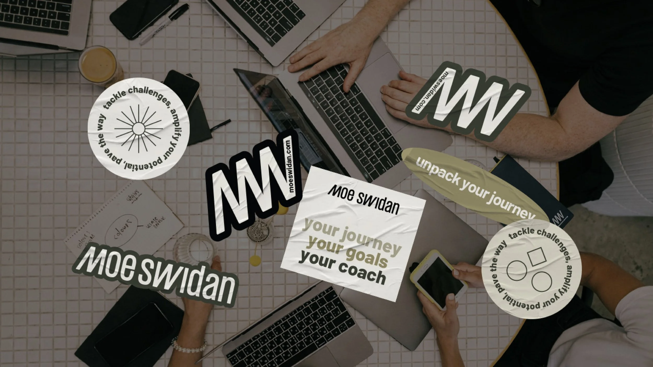
At the core sits a simple, lowercase logotype - approachable, human, and grounded. The emblem emerges from the interplay between the letters M and W, subtly forming a sense of motion and growth. It reflects Moe’s philosophy: progress isn’t linear, but it always moves forward. The final upward line becomes a quiet signal of improvement - earned, not forced.
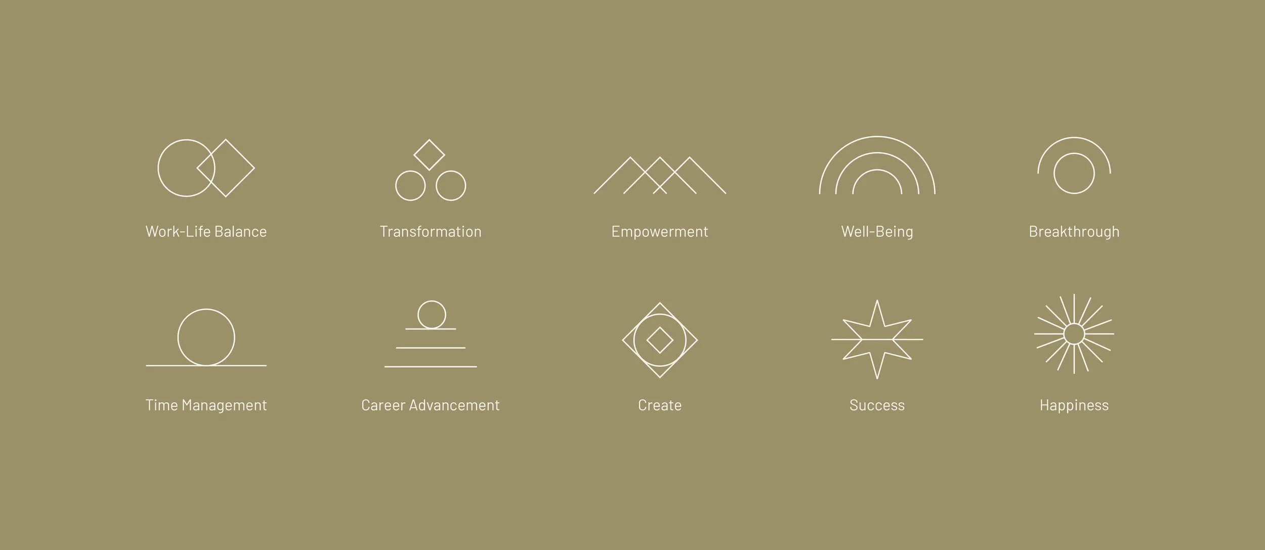
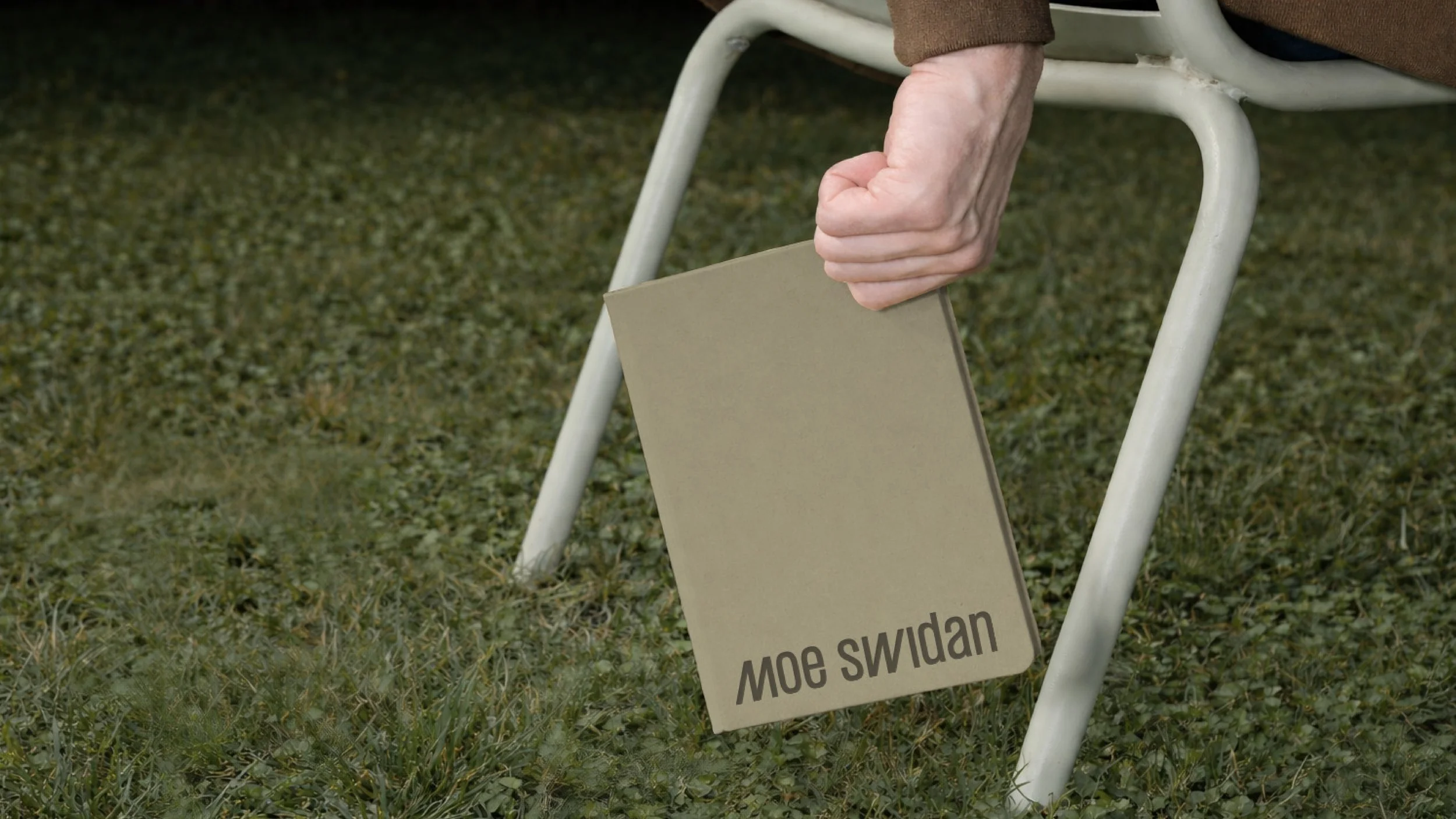
The wider identity system is constructed using basic geometric elements, reinforcing the idea that clarity comes from simplifying. Nothing excessive, nothing distracting, just what matters. A palette of khaki and earthy greens introduces warmth and balance, allowing the messaging to lead while the visuals support. Compositions remain restrained and intentional, creating space for reflection rather than noise.
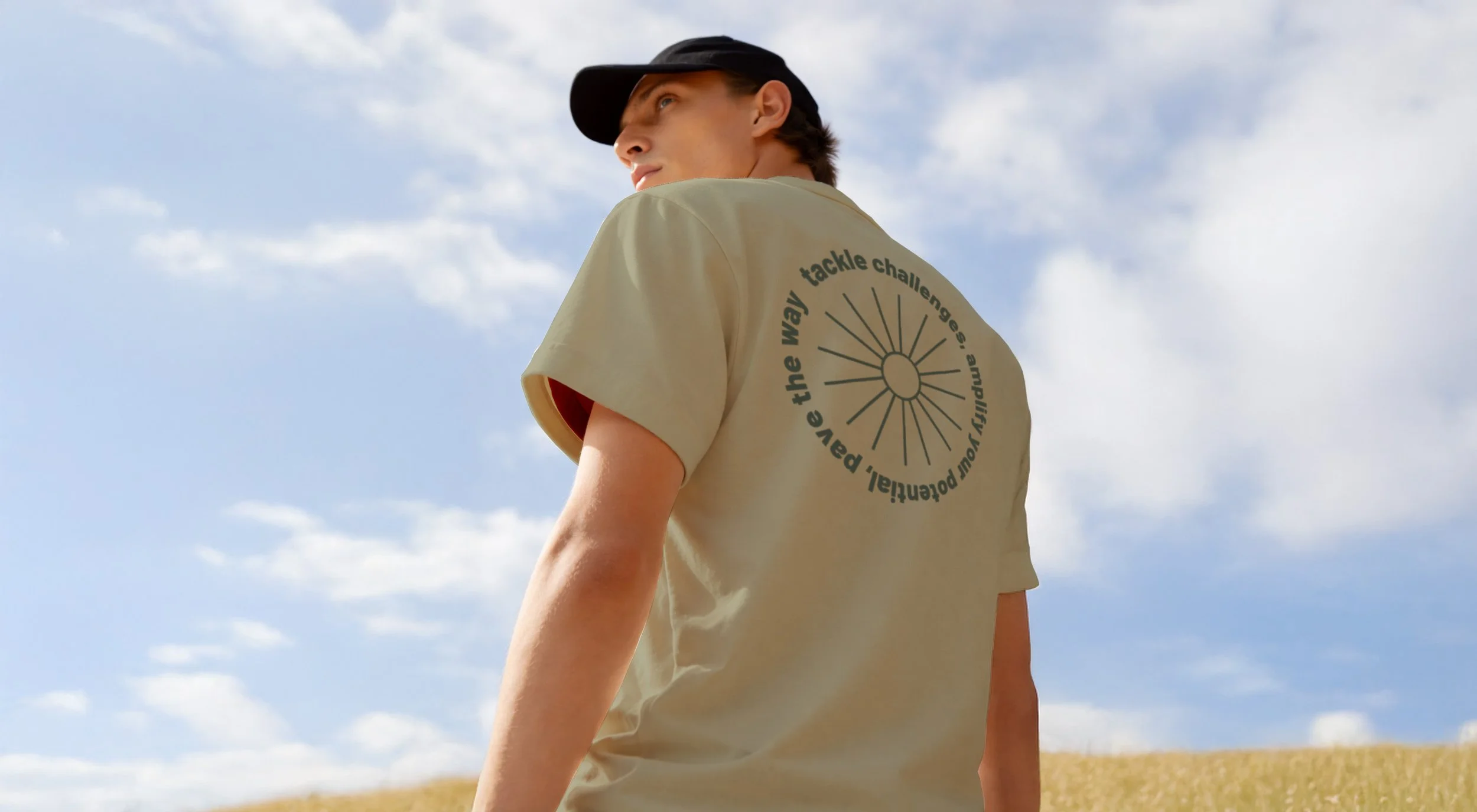
Photography follows the same thinking, capturing movement, effort, and scale. Individuals within larger environments, moments of transition, paths unfolding. It’s less about the destination, more about the shift.
The result is a brand that feels calm, grounded, and forward-looking, aligned with Moe’s approach to growth: steady, conscious, and deeply human.